

Taylor Rae Roman with BluelandSponsored
Esc
How Blueland sells laundry tablets by crossing out ingredients
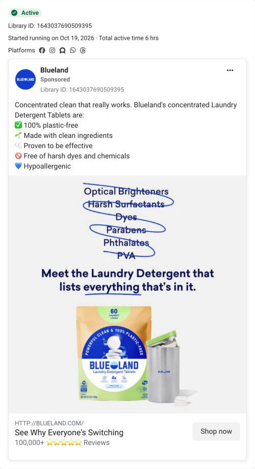
A Blueland static that started on Meta on Oct 19, 2026. A hand-scribbled list crosses out optical brighteners, harsh surfactants, dyes, parabens, phthalates and PVA above the line “Meet the Laundry Detergent that lists everything that's in it.” A laundry pouch and steel tin sit below, and the ad links to the Laundry Starter Set product page.
Blueland
3 creatives lead here1 / 3
Laundry Starter Set

See Why Everyone's Switching
The ad introduces concentrated laundry tablets with a checklist of cleaning and ingredient-related messages. The CTA leads to the Laundry Starter Set product route. Compare the creative with the destination and explore the other ads sharing this route.
- Brand
- Blueland
- Observed offer
- Laundry Detergent Tablets starter set
- Creative angle
- Product benefits
- Page type
- Product page
- Ad format
- Image
- Listed start date
- Oct 19, 2026 · Total active time 6 hrs
- Captured
- Oct 19, 2026
- Library ID
- 1643037690509395
- Destination
- blueland.com
Selected for its design and offer structure. Ad performance isn’t available in this collection.
What this ad does well
The crossed-out list is the hook, and it's a good one: six ingredient names with a blue pen scribble through each, so you read “this one leaves things out” before you read a single sentence. Transparency is the positioning here, and the headline says it directly (a detergent that lists everything that's in it), which answers skepticism before anyone voices it. The product shot underneath is simple (the pouch and its refill tin), so the eye goes from the problem list straight to the answer. The copy backs it up with a short checklist covering plastic-free, hypoallergenic and free of harsh dyes.
What's missing
The ad names ingredients but not why they matter to the person reading. Most people don't know what an optical brightener or PVA is, so the list can read as jargon. There's also no proof of cleaning in the image and no offer or price, so the only reason to tap is curiosity. If you make one like this, pick the one or two ingredients your audience already worries about and say why in a few words, then add a review line or a stain shot so the clean claim has support.
Beat by beat
- ImageOptical Brighteners, Harsh Surfactants, Dyes, Parabens, Phthalates and PVA, each scribbled through with a blue pen line.
The scribble turns a list of chemicals into a visual “leave it out,” so the point lands before any reading.
- Headline“Meet the Laundry Detergent that lists everything that's in it,” with everything underlined.
It frames honesty about ingredients as the reason to choose this brand.
- ProductA green-topped laundry tablet pouch next to a steel refill tin with loose tablets.
It shows the format and the refill system in one shot.
- CopyA checklist: plastic-free, clean ingredients, “Proven to be effective,” free of harsh dyes and chemicals, and hypoallergenic.
The bullets add cleaning and skin claims to the ingredient story.
Where it sends people
The ad links to the Laundry Starter Set product page, a basic product page on the ladder rather than a page built around ingredient transparency. The page does have the material this ad sets up, just further down: a “How We Stack Up” comparison table against four named competitors (with rows on ingredients and plastic) follows the anchor nav, and a values tab lists excluded ingredients on a card with x icons. A visitor who tapped because of the crossed-out list has to scroll past the buy box, review band and a new-product promo to reach that. Moving the free-from card or comparison up near the buy box would pay off this ad faster.
The page it sends people to: How Blueland's Laundry Starter Set page sells a refill plan
Blueland's Laundry Starter Set page is a full product page whose buy box sells an autoship refill plan. A before and after stain carousel follows, then an anchor nav leads into a comparison against four competitors, values, how it works, scents, an FAQ and reviews. Three ads in the Fluid library send people here, one creator video and two product-benefit statics.
How the page is built
- 01Announcement bar and header
A shipping-and-returns line and category sub-nav answer whether this store is established and what else it sells.
- 02Buy box
Scent buttons, quantity cards with usage guidance and a what's-included line answer which version do I need.
- 03Plan and cart
A pre-selected autoship card with a delay-or-cancel note, plus today's total and recurring price, answers what will I pay now and later.
- 04Add-on and details
A popular add-on row and overview, ingredients and sustainability tabs answer what else might I need and what's in it.
- 05Review with proof photos
A customer quote beside a before and after stain carousel answers does it actually get stains out.
- 06New-product promo and anchor nav
A dark band introduces an upgraded version, then jump links let a visitor go straight to the question they care about.
- 07Comparison table
“How We Stack Up” against four named competitors on format, plastic, ingredients and cost per load answers why this over what I use now.
- 08Values tabs
An excluded-ingredients card, certification logos and a parent-and-child photo answer is it safe for my family.
- 09How it works
Two numbered steps beside a photo of a hand dropping a tablet into a washer answer how do I use it.
- 10Scent carousel
Scent cards with themed backgrounds answer which scent will I like.
- 11FAQ
An accordion with questions on price, why to autoship and how it differs from alternatives answers the remaining objections.
- 12Reviews
A rating distribution, AI-written summary, customer photos, filters and verified review rows answer what do people like me think.
The first fixes we would make
- The comparison table, the strongest answer to “why switch,” sits below a new-product promo band that pulls attention to a different version. Move the comparison table up so it follows the stain proof directly, and push the promo lower.
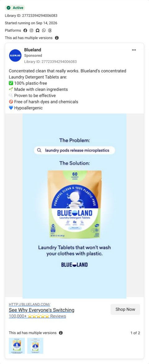
- Nothing near the top speaks to the visitors the ads send here, such as parents (from the creator video) or people worried about pods and ingredients (from the statics). Add one line under the product name that names the pod-versus-tablet switch, so ad traffic sees its reason in the first screen.
Read the full breakdown of this page
Three hooks you could test
- Lead with the uncomfortable problem. “Can you name what's in your detergent? Most labels don't tell you.”
- Turn the benefit into a picture people get in a second. “Six ingredients, crossed out. Here's what's left.”
- Call out the habit you're replacing. “Still buying the jug with the mystery ingredient list?”
What to borrow for your brand
- Cross out the ingredients or materials you leave out with a hand-drawn scribble, so your free-from claim is visual instead of a bullet list.
- Make transparency the headline itself, the way Blueland says its detergent lists everything inside, when your category hides its labels.
- Keep the product shot plain under a busy hook so the eye moves from the problem straight to the product.
One of 9 Blueland ads in the Fluid Inspiration Library, captured from the Meta Ad Library on Oct 19, 2026. We record that an ad ran publicly, not how it performed.