

Bio.meSponsored
Esc
How Bio.me sold a clean label with a creator's supplement aisle story
A 43-second creator video for Bio.me. A man in a kitchen holds the Daily Prebiotic Fiber pouch and explains that he used to grab any fiber powder until he read the labels, then covers two ingredients, unflavored mixing and a glyphosate residue free certification. No price. It ran on Meta from Sep 18, 2026 and links to the product page.
Bio.me
18 creatives lead here1 / 18
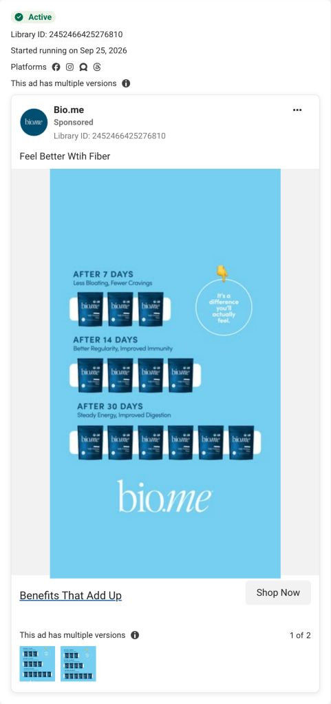
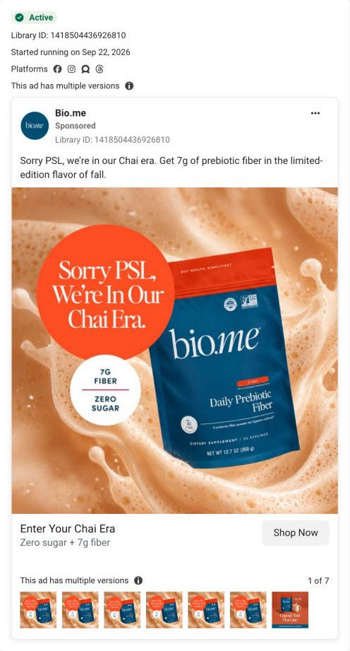
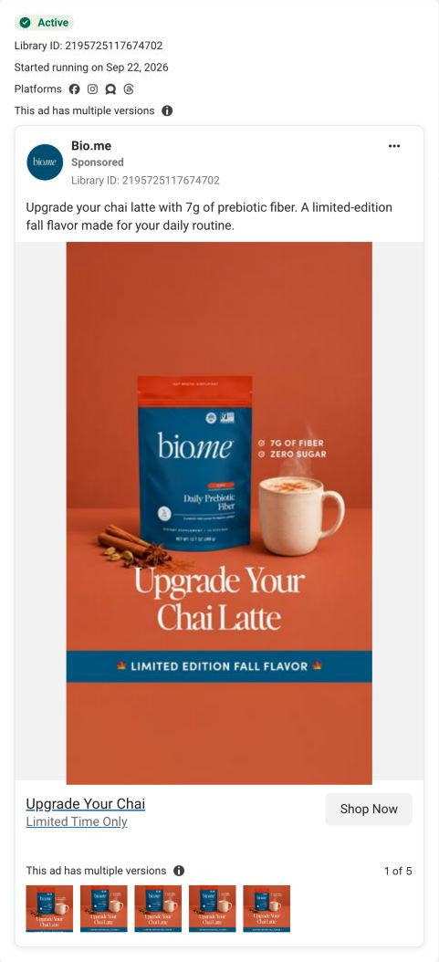
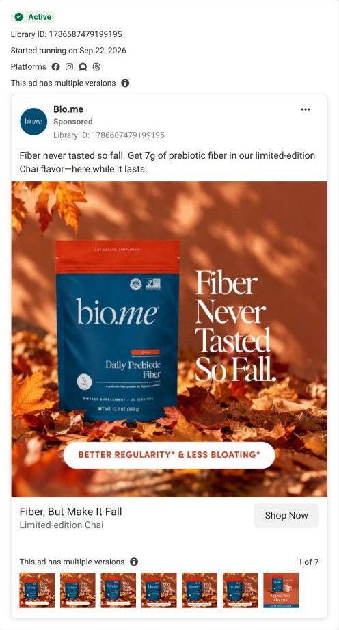
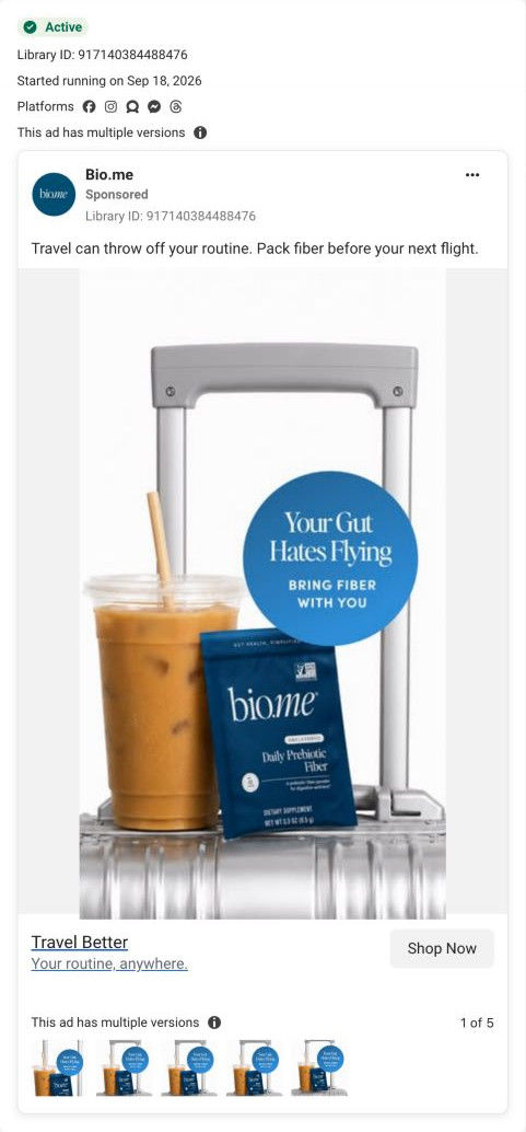
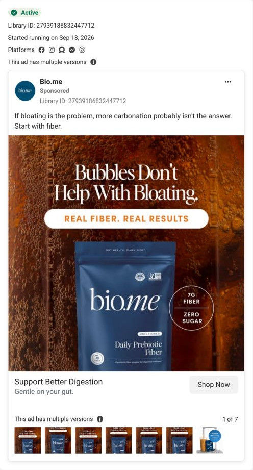
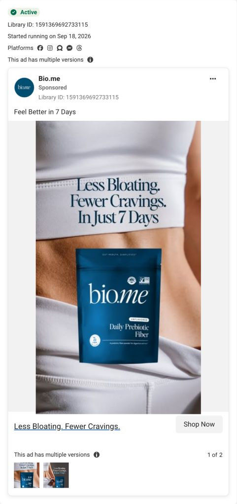
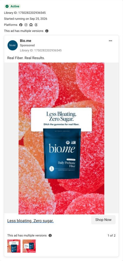


Bio.me · Daily Prebiotic Fiber
Advertiser benefit claims are shown as advertising examples. The landing page was captured on October 20, 2026 and may show a different offer from the ad.
Daily Prebiotic Fiber
A male creator holds the pouch in a kitchen while the ad copy invites viewers to pay attention to ingredient labels. Compare the creative with the destination and explore the other ads sharing this route.
- Brand
- Bio.me
- Observed offer
- Ingredient-label comparison; no price or discount stated
- Creative angle
- Product education
- Page type
- Product page
- Ad format
- Video · 0:43
- Listed start date
- Sep 18, 2026
- Captured
- Oct 20, 2026
- Library ID
- 1769864007675516
- Destination
- bio.me
Selected for its design and offer structure. Ad performance isn’t available in this collection.
What this ad does well
The creator tells a story a label reader recognizes: standing in the supplement aisle, grabbing the first fiber powder, then realizing many weren't as clean as they looked. That gives the ad a clear audience (people who read ingredient lists) and a reason to choose Bio.me that isn't just a benefit claim. He backs it with specifics, saying it has two ingredients, mixes unflavored into anything, and is clinically tested and certified glyphosate residue free. The copy line about paying attention to labels lines up with the voiceover, so the ad says one thing throughout.
What's missing
The ad is about comparing labels, and it never shows one. He says other powders aren't as clean as they look, but the viewer never sees what's in them or what's in Bio.me's. His closing benefits (more energy for workouts, less sluggish after meals) also shift away from the label story. If you make one like this, hold the competitor-style label next to yours for a few seconds, circle the difference, and keep the ending on the label rather than a new set of benefits.
Beat by beat
- 0-5sHe holds the pouch and says he used to think any fiber powder was enough.
The self-correction sets up a contrast with what he uses now.
- 5-15sHe describes grabbing the first powder in the supplement aisle, then realizing many aren't as clean as they look.
It names a real habit and a doubt the viewer may share.
- 15-28sHe covers 7 grams per scoop, unflavored mixing and two ingredients.
The ingredient count is the proof of his clean-label point.
- 28-35sHe says it's clinically tested and certified glyphosate residue free.
Third-party style claims give label readers something concrete.
- 35-43sHe mentions feeling better overall and closes on caring what's in your supplements.
It ties the story back to the audience before the call to action.
Where it sends people
It sends people to the Daily Prebiotic Fiber product page, which sits on the weakest rung of the landing-page ladder (a standard product page rather than a page built around one problem, or the quiz Bio.me already links in its header). For this ad, the page does a solid job: the trust strip right after the review highlight lists residue free, non-GMO and third-party tested, and the ingredients and supplement facts accordions sit in the buy column. What's missing is the comparison he sets up. A short label comparison near the trust strip would let the page finish his argument.
The page it sends people to: How Bio.me's Daily Prebiotic Fiber page sells a subscription
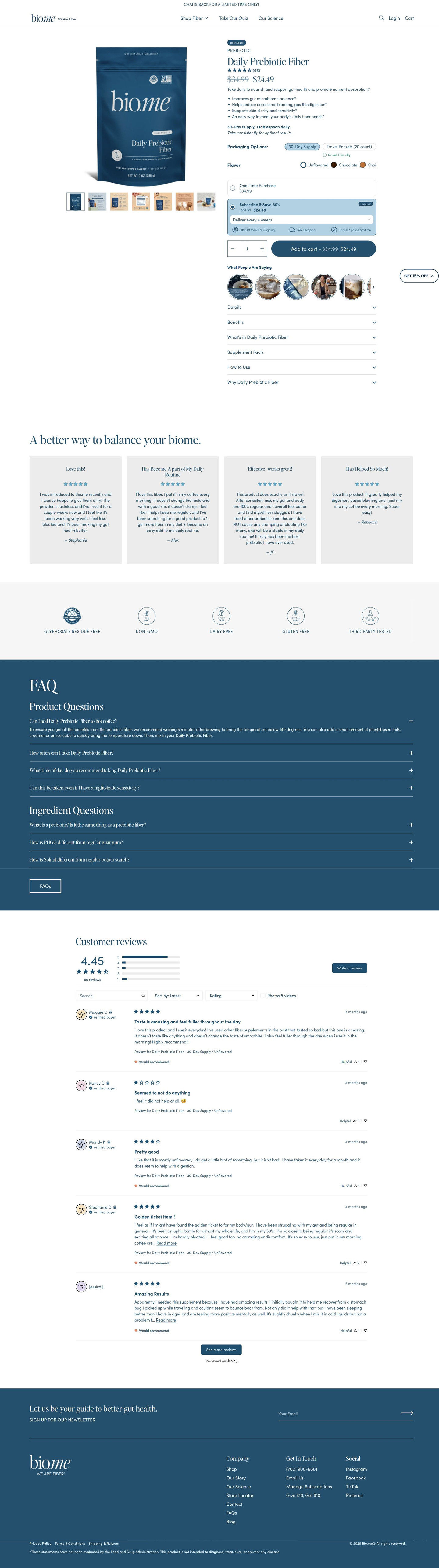
Bio.me's Daily Prebiotic Fiber product page is short and subscription-first: the buy box carries the price, flavors, a pre-selected Subscribe & Save card and customer videos, with reviews, trust icons and an FAQ below. 18 ads in the Fluid library send people here, from Chai launch statics and habit-switch images to creator stories and comment replies.
How the page is built
- 01Announcement bar
A single limited-time line about the seasonal Chai flavor answers whether there's anything new worth buying now.
- 02Buy box
A pack shot with a gallery of infographic, lifestyle and supplement-facts images sits beside the badge, rating, price, a one-line promise, benefit bullets, a dosage line and the packaging and flavor selectors, answering what it is, what it costs and which version to pick.
- 03Purchase options
A one-time card and a pre-selected Subscribe & Save card with a delivery dropdown and perk icons answer how to save and whether a subscription locks you in.
- 04Customer videos
A row of round UGC thumbnails titled What people are saying sits directly under Add to cart and answers whether real people use it.
- 05Buy-column accordions
Details, benefits, ingredients, supplement facts, how to use and why this product answer the label reader's questions without making the page longer.
- 06Review highlight
A headline and quote cards with titles, stars and first names answer whether it works for people like the buyer, in customers' words.
- 07Trust strip
Line icons for residue free, non-GMO, dairy free, gluten free and third-party tested answer whether it's clean and safe to try.
- 08FAQ
Product and ingredient questions on a brand-color band handle the remaining objections before checkout.
- 09Full reviews
An average rating, distribution bars, search, sort and filters let a careful buyer dig into the reviews.
- 10Newsletter and footer
A newsletter band and the footer with the supplement disclaimer catch visitors who aren't ready to buy.
The first fixes we would make
- Many of the ads sell a specific flavor or format (Chai, Chocolate, travel packets), but the observed page opens on the Unflavored 30-day pouch. Link each ad to its matching variant so the selector and main image already show what the click promised.
- Several ads lead with bloating, while the page's opening promise is broad gut health. Build a bloating landing page, or route those ads into the quiz Bio.me already links in its header, so the page starts on the problem the ad named.
Read the full breakdown of this page
Three hooks you could test
- Call out the habit you're replacing. “Grabbing whatever's on the shelf? Flip the bag first.”
- Make the product the whole scene. “Here's the entire ingredient list. It fits on one line.”
- Lead with the uncomfortable problem. “I read the label on the stuff I'd been taking for a year.”
What to borrow for your brand
- Tell the story of the shopping moment (the aisle, grabbing the first thing) to make a clean-label claim feel personal.
- Use your ingredient count as the proof point when your audience reads labels.
- Echo the voiceover's single idea in the primary text so the copy and the video argue the same thing.
Transcript
I used to think it was enough to just take any fiber powder, but then I tried this one from biome and the difference is next level. Spending hours in the supplement aisle. Hes not my idea of fun. So I always just grab the 1st fiber powder I could find. But when I finally started to pay attention on what was in them, I realized a lot of them aren't as clean as they look. I needed a better option and honestly, biome was a done deal. Their daily prebiotic fiber has 7 grams of fiber and one scoop. It's unflavored, so I can pretty much add it into anything and there's only 2 ingredients. I like that, it's just clean. No fillers, no weird additives, nothing extra. It's clinically tested and it's certified glasses are residue free, which is a huge plus. And it's generally helped me feel so much better overall. More energy for my workouts, not as sluggish after meals. And I never have the 2nd guess the ingredient. If you actually care what's genuinely in your supplements. Biome is 100% worth it.
Text on screen
- biome
- I used to think it was enough to
- Daily Pres
- just take any fiber powder
- Daily Prebe
- but then I tried this one from Bio.me
- Daily Thebi
- and the difference is next level.
- Spending hours in the supplement aisle
- is not my idea of fun
- so. I always just grab the first fiber powder I could find
- but when i finally started to
- pay attention on what was in them
- I realized a lot of them aren't as clean as they look.
- I needed a better option and honestly
- Their Daily Prebiotic Fiber has
- 7 grams of fiber in one scoop.
- Daily Fretter
- Daily Presse
- so l could pretty much add it into anything
- bion
- and there's only two ingredients.
- I like that it's just clean.
- Daily Preten
- no fillers, no weird additives.
- Daily Pretee
- It's clinically tested
- biame
- and it's certified glyphosate residue free
- which is a huge plus
- Fiber
- and it's generally heiped me feel so much better overall.
- More energy for my workouts.
- not as sluggish after meals.
- and I never have to second guess the ingredient.
- If you actually care
- Daily Froice
- what's genuinely in your supplements
- Bio.me is 100% worth it.
- Daily Probine
One of 20 Bio.me ads in the Fluid Inspiration Library, captured from the Meta Ad Library on Oct 20, 2026. We record that an ad ran publicly, not how it performed.