

Bio.meSponsored
Esc
How Bio.me used pumpkin spice season to launch a Chai fiber
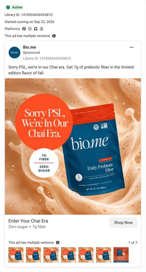
A static image ad announcing Bio.me's limited-edition Chai Daily Prebiotic Fiber. The Chai pouch sits in latte foam beside an orange badge that teases pumpkin spice lattes, with 7g fiber and zero sugar callouts. It ran on Meta from Sep 22, 2026 and links to the Daily Prebiotic Fiber product page.
Bio.me
18 creatives lead here1 / 18


Bio.me · Daily Prebiotic Fiber
Video references use a captured frame. Advertiser benefit claims are shown as advertising examples. The landing page was captured on October 20, 2026 and may show a different offer from the ad.
Sorry PSL, we’re in our Chai era
The Chai pack sits against a foamy latte, with a bright orange “Chai era” badge and fiber and zero-sugar callouts. Compare the creative with the destination and explore the other ads sharing this route.
- Brand
- Bio.me
- Observed offer
- Limited-edition Chai; 7g fiber and zero sugar advertised
- Creative angle
- Seasonal launch
- Page type
- Product page
- Ad format
- Image
- Listed start date
- Sep 22, 2026
- Captured
- Oct 20, 2026
- Library ID
- 1418504436926810
- Destination
- bio.me
Selected for its design and offer structure. Ad performance isn’t available in this collection.
What this ad does well
Bio.me borrows a moment everyone already knows. Pumpkin spice season is the obvious rival in a fall coffee feed, so the line “Sorry PSL, we're in our Chai era” gets attention by picking a friendly fight with it. The latte foam behind the pouch tells you how to use the product before you read anything, and the round callouts (7g fiber, zero sugar) give the flavor news a practical reason to care. The link headline, Enter Your Chai Era, keeps the joke going all the way to the button.
What's missing
The ad sells a flavor to people who already want a fiber drink, but it never tells someone new why they'd add fiber to their latte at all. A viewer who isn't thinking about gut health sees a cute pouch and scrolls. It also calls the flavor limited edition without saying how limited, so there's no real reason to act this week. If you make a seasonal launch like this, add one line on what the product does for the customer, and give the limit a true end date or a stock note.
Beat by beat
- CopyThe primary text repeats the PSL line and adds 7g of prebiotic fiber in the limited-edition flavor of fall.
It turns the joke into a product announcement with one concrete number.
- ImageThe Chai pouch sits in swirling latte foam with a large orange badge carrying the PSL line.
The foam shows the use case and the badge gives the eye a bright place to land first.
- ImageA white circle lists 7G fiber and zero sugar.
It answers the obvious question about a flavored drink (is it full of sugar?) right on the image.
- HeadlineEnter Your Chai Era, with zero sugar plus 7g fiber as the description.
It repeats the joke and the two facts next to the button, so the click feels consistent.
The offer
No price. The offer is the limited-edition Chai flavor, framed as a fall moment with 7g fiber and zero sugar advertised.
Where it sends people
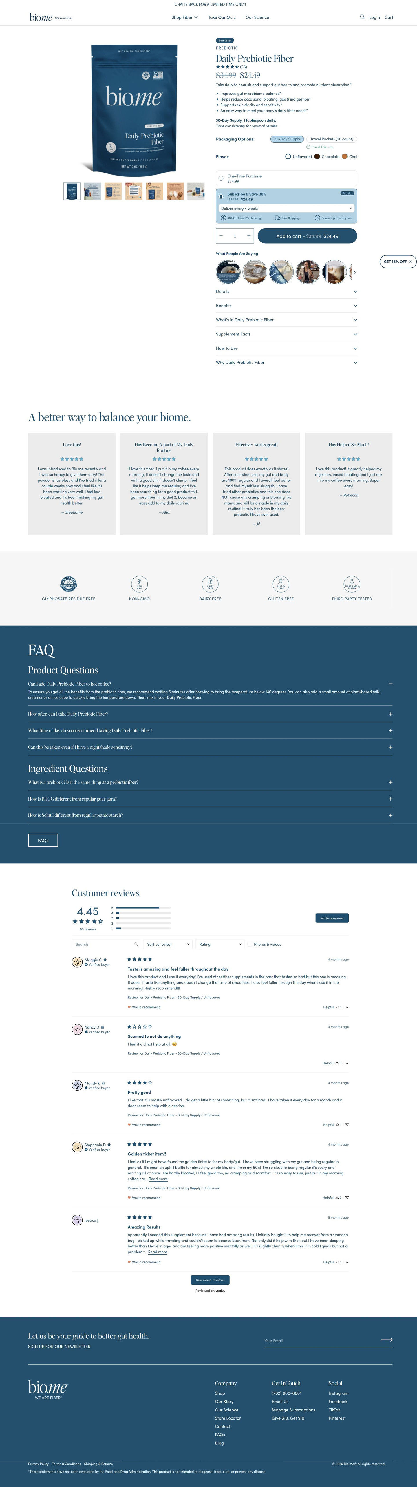
It links to the Daily Prebiotic Fiber product page, a standard product page rather than a page built for the Chai launch. The page's announcement bar does say Chai is back for a limited time, which is a good bridge. But the observed page opens with Unflavored selected, so someone who clicked a Chai ad lands on a blue unflavored pouch and has to find the Chai swatch themselves. Linking straight to the Chai variant, with the Chai image in the main slot, would carry the ad's promise onto the page.
The page it sends people to: How Bio.me's Daily Prebiotic Fiber page sells a subscription
Bio.me's Daily Prebiotic Fiber product page is short and subscription-first: the buy box carries the price, flavors, a pre-selected Subscribe & Save card and customer videos, with reviews, trust icons and an FAQ below. 18 ads in the Fluid library send people here, from Chai launch statics and habit-switch images to creator stories and comment replies.
How the page is built
- 01Announcement bar
A single limited-time line about the seasonal Chai flavor answers whether there's anything new worth buying now.
- 02Buy box
A pack shot with a gallery of infographic, lifestyle and supplement-facts images sits beside the badge, rating, price, a one-line promise, benefit bullets, a dosage line and the packaging and flavor selectors, answering what it is, what it costs and which version to pick.
- 03Purchase options
A one-time card and a pre-selected Subscribe & Save card with a delivery dropdown and perk icons answer how to save and whether a subscription locks you in.
- 04Customer videos
A row of round UGC thumbnails titled What people are saying sits directly under Add to cart and answers whether real people use it.
- 05Buy-column accordions
Details, benefits, ingredients, supplement facts, how to use and why this product answer the label reader's questions without making the page longer.
- 06Review highlight
A headline and quote cards with titles, stars and first names answer whether it works for people like the buyer, in customers' words.
- 07Trust strip
Line icons for residue free, non-GMO, dairy free, gluten free and third-party tested answer whether it's clean and safe to try.
- 08FAQ
Product and ingredient questions on a brand-color band handle the remaining objections before checkout.
- 09Full reviews
An average rating, distribution bars, search, sort and filters let a careful buyer dig into the reviews.
- 10Newsletter and footer
A newsletter band and the footer with the supplement disclaimer catch visitors who aren't ready to buy.
The first fixes we would make
- Many of the ads sell a specific flavor or format (Chai, Chocolate, travel packets), but the observed page opens on the Unflavored 30-day pouch. Link each ad to its matching variant so the selector and main image already show what the click promised.
- Several ads lead with bloating, while the page's opening promise is broad gut health. Build a bloating landing page, or route those ads into the quiz Bio.me already links in its header, so the page starts on the problem the ad named.
Read the full breakdown of this page
Three hooks you could test
- Call out the habit you're replacing. “Sorry, seasonal syrup. This year's fall drink actually does something.”
- Make the product the whole scene. “The pouch, the foam, the steam. Fall is in the bag.”
- Show a specific moment of use. “First cold morning of the year, one scoop into the latte.”
What to borrow for your brand
- Name the seasonal product your customer already buys and position your launch as the friendly alternative, so you inherit attention that's already there.
- Put the two facts that answer the first objection (here, sugar and grams of fiber) in a callout on the image itself.
- Keep the joke going in the link headline so the image, the copy and the button all sound like the same voice.
One of 20 Bio.me ads in the Fluid Inspiration Library, captured from the Meta Ad Library on Oct 20, 2026. We record that an ad ran publicly, not how it performed.