How ARMRA builds its colostrum jar product page for ad traffic | Fluid
Esc

How ARMRA builds its colostrum jar product page for ad traffic

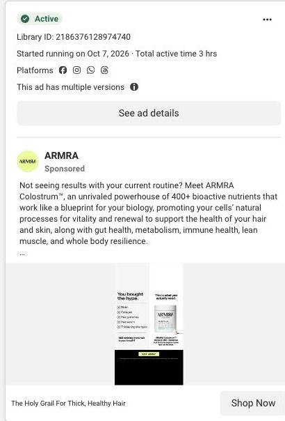
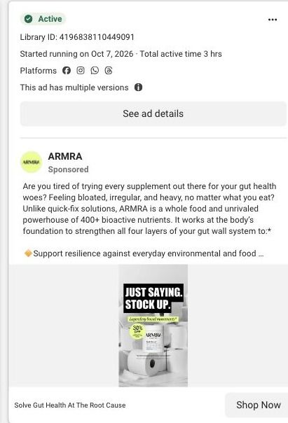
This is ARMRA's product page for the Unflavored Colostrum Jar. A buy box with size, flavor, subscription and one-time choices leads into results, routine, a supplement-cost comparison, sourcing education and reviews. 21 ARMRA ads in the Fluid library link here, mostly creator stories, plus offer-led and education ads.

ARMRA
21 creatives lead here1 / 21
ARMRA · Unflavored Colostrum Jar

Public page captured October 22, 2026. Promotional sheets, chat, extension overlays and sticky cart bars were removed from the static reference; page layout and copy were preserved. No account, personal, health or payment details were supplied. Quiz captures show the observed entry screen, not the complete consultation.

ARMRA: full page screenshot

ARMRA · Unflavored Colostrum Jar

This is ARMRA's product page for the Unflavored Colostrum Jar. A buy box with size, flavor, subscription and one-time choices leads into results, routine, a supplement-cost comparison, sourcing education and reviews. 21 ARMRA ads in the Fluid library link here, mostly creator stories, plus offer-led and education ads.

Brand
ARMRA
Page type
Product page
Ads leading here
21
Captured
Oct 22, 2026
Destination
armra.com

Selected for its design and offer structure. Ad performance isn’t available in this collection.

What this page does well

The page answers the big buying questions in the order people usually ask them. The buy box puts rating, benefit copy and the subscription choice next to the purchase button, so someone arriving from an ad can buy without hunting. Right after the product details, the results block shows large metrics with qualification text beside them (the claims stay framed as ARMRA's study findings rather than a promise), and the usage routine shows how the product fits into a day. The supplement-routine cost comparison is the strongest section on the page, because it turns a premium price into a comparison with the stack of products someone might already be paying for. Sourcing and technology education, an ingredient carousel and customer reviews then handle the skeptic who wants to know where colostrum comes from and what other customers say.

How the page is built

  1. 01
    Announcement and navigation

    The announcement strip, store navigation and breadcrumb tell visitors where they are and surface the current offer.

  2. 02
    Buy box

    The gallery sits beside rating, product name, benefit copy, size and flavor selectors, subscription and one-time choices, quantity and the purchase button, answering what it is, what it costs and how to buy.

  3. 03
    Product accordions and add-ons

    Product-information accordions and complementary-product cards answer detailed questions and offer related items for a bigger order.

  4. 04
    Results block

    Large metrics with qualification text answer whether people report results, with the claims presented as ARMRA's study findings.

  5. 05
    Usage routine

    A routine with supporting imagery answers how someone actually takes it day to day.

  6. 06
    Routine cost comparison

    A comparison against a supplement routine answers whether the price is worth it compared with what a shopper might already buy.

  7. 07
    Benefit map and sourcing education

    A whole-body benefit map and sourcing and technology education answer what ARMRA says the product does and where it comes from.

  8. 08
    Ingredient carousel

    A carousel of ingredient categories answers what's inside, in a visual form that's easy to scan.

  9. 09
    Reviews and disclaimers

    Customer reviews, disclaimers and the footer answer what other buyers say and close out the page.

What's missing, in the order we'd fix it

  1. 21 captured ads land on this same page, from creator stories about transformation to gut health and hair headlines, but the buy box speaks to every visitor the same way. Build angle-specific landing pages (ARMRA already has gut, hair and aging versions elsewhere) and route each ad headline to the page that opens on its promise.
  2. The cost comparison and the reviews both sit well below the buy box, so a shopper weighing the price at the button doesn't see either. Pull a one-line version of the routine comparison and the review rating right under the purchase button.
  3. The blueprint shows no guarantee or what-to-expect timeline near the buy box. If ARMRA offers a guarantee, put it under the button, and add a short timeline of what customers report over the first weeks, framed as reported experience rather than a promise.

How the ads set it up

ARMRA's ads that land here are mostly creator-story videos, with headlines about visible transformation and "Solve Gut Health At The Root Cause". The page picks those up broadly: the benefit copy, results block and whole-body benefit map cover the general transformation promise, and the reviews echo the creator voice. A viewer who clicked a gut-health ad, though, lands on a general product page and has to find gut-specific content on their own, so the match is loose compared with ARMRA's dedicated campaign pages.

What to borrow for your brand

  • Put a cost comparison against the routine your customer already pays for on the product page, so a premium price reads as replacing several products instead of adding one.
  • Show results as large metrics with the qualification text right beside them, so the proof is easy to scan and the claim stays accurately scoped.
  • Follow the buy box with a usage routine before the deep science, so shoppers can picture taking the product before they're asked to read about how it's made.

Ads that send people here

Captured from armra.com in October 2026 for the Fluid Inspiration Library. Offers and prices change; this is what the page showed when we captured it.