How ARMRA uses a 7 reasons listicle as a landing page | Fluid
Esc

How ARMRA uses a 7 reasons listicle as a landing page

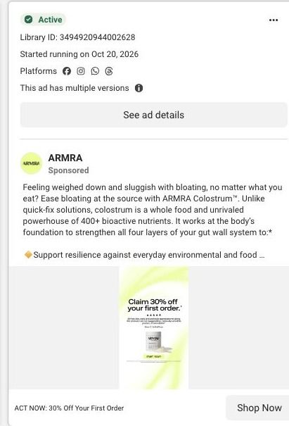
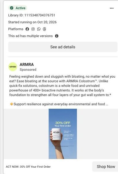
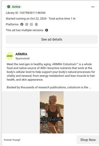
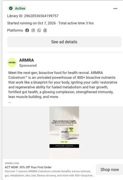
ARMRA's 7 reasons page is a numbered educational landing page. A split benefit hero leads into numbered reasons with repeated CTAs, then an embedded product offer, proof metrics and an FAQ. 10 ARMRA ads in the Fluid library link here, mixing creator stories, personal results, product-benefit statics and "ACT NOW: 30% Off Your First Order" offer ads.

ARMRA
10 creatives lead here1 / 10
ARMRA · 7 reasons

Public page captured October 22, 2026. Promotional sheets, chat, extension overlays and sticky cart bars were removed from the static reference; page layout and copy were preserved. No account, personal, health or payment details were supplied. Quiz captures show the observed entry screen, not the complete consultation.

ARMRA: full page screenshot

ARMRA · 7 reasons

ARMRA's 7 reasons page is a numbered educational landing page. A split benefit hero leads into numbered reasons with repeated CTAs, then an embedded product offer, proof metrics and an FAQ. 10 ARMRA ads in the Fluid library link here, mixing creator stories, personal results, product-benefit statics and "ACT NOW: 30% Off Your First Order" offer ads.

Brand
ARMRA
Page type
Educational landing page
Ads leading here
10
Captured
Oct 22, 2026
Destination
armra.com

Selected for its design and offer structure. Ad performance isn’t available in this collection.

What this page does well

The listicle format suits a visitor who clicked an ad but isn't ready to buy, because each numbered reason gives them one more argument to consider before the price shows up. ARMRA keeps the header compact with an offer strip, so the discount from the offer-led ads is visible the moment someone lands. The reasons alternate images and explanatory text with a CTA after them, which means a reader can act whenever a reason lands without scrolling to the bottom. The full product offer with size, flavor and purchase choices is embedded on the page, and the proof metrics and repeated offer prompts after it give a second push to people who scrolled past it the first time.

How the page is built

  1. 01
    Campaign header and offer strip

    A compact header with an offer strip answers whether there's a deal right now and keeps the store navigation out of the way.

  2. 02
    Split benefit hero

    A portrait beside explanatory copy and a CTA answers what this page is about and gives an early way to act.

  3. 03
    Trust bar and benefit navigation

    A trust bar and short benefit navigation answer whether the brand is credible and let readers jump to the reason they care about.

  4. 04
    Numbered reasons

    Numbered reasons alternate images and explanations with repeated CTAs, answering why someone should consider colostrum, in ARMRA's words.

  5. 05
    Embedded product offer

    Size, flavor and purchase choices answer what to buy and let the visitor check out on this page.

  6. 06
    Proof metrics and offer prompts

    Proof metrics and repeated offer prompts answer whether other people report results and remind the reader of the deal.

  7. 07
    FAQ and footer

    An FAQ and the brand and newsletter footer answer the last practical questions and capture readers who still aren't ready.

What's missing, in the order we'd fix it

  1. The page carries a lot of ad angles at once (creator transformation stories, an aging-themed static and first-order discount ads), and the hero speaks to all of them the same way. Reorder or swap the opening reason based on the ad, so an aging ad opens on the aging reason and an offer ad opens on the deal.
  2. Proof metrics come after the embedded offer, so the reader sees the price before the strongest evidence. Move a short version of the metrics into the trust bar near the top, keeping the qualification text attached.
  3. The offer-led ads promise 30% off the first order, but the blueprint doesn't show that exact framing repeated at the embedded buy box. Restate the discount and how to claim it right beside the purchase button, so the ad's promise is visible at the moment of purchase.

How the ads set it up

Creator-story and personal-results videos about transformation land here alongside offer statics that promise 30% off the first order. The page handles the offer ads well because the offer strip shows up in the header the moment they land. The creator ads promise a personal transformation, and the numbered reasons pick that up as education, which is a reasonable bridge for a viewer who wants to understand the product before buying, though the page never returns to a creator's voice the way the ads open.

What to borrow for your brand

  • Use a numbered-reasons landing page for ad traffic that isn't ready to buy, and put a CTA after the reasons so readers can act on whichever one convinces them.
  • Keep the offer strip in a compact campaign header, so visitors from discount ads see the deal immediately without the full store navigation pulling them away.
  • Embed the complete buy box inside the educational page, so the argument and the purchase live on one URL instead of sending readers to a separate product page.

Ads that send people here

Captured from armra.com in October 2026 for the Fluid Inspiration Library. Offers and prices change; this is what the page showed when we captured it.