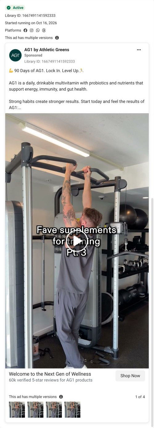
What this ad does well
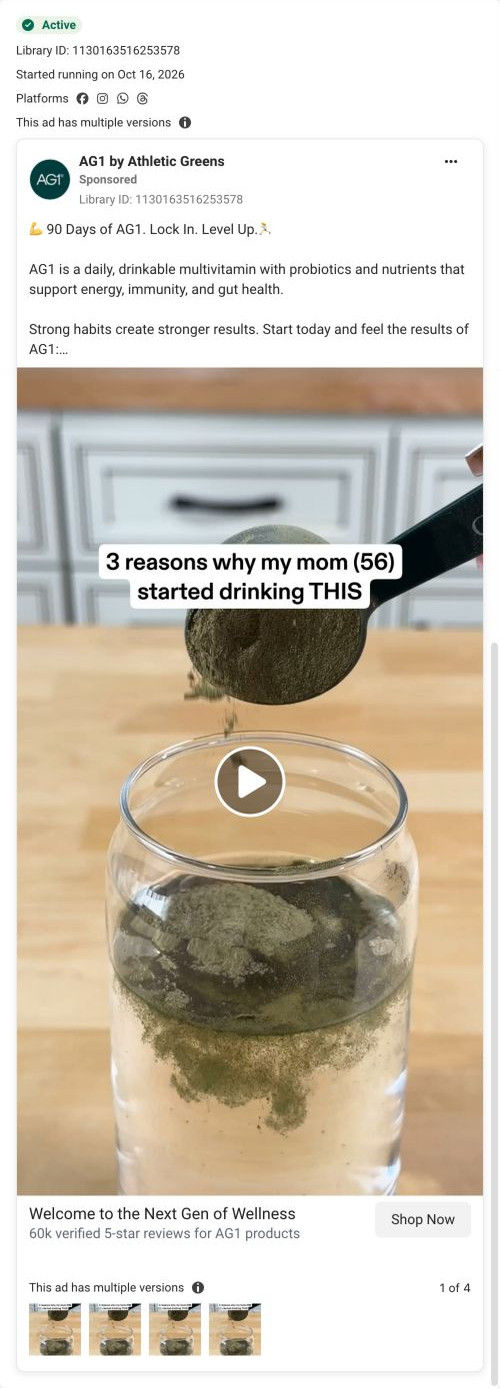
The caption “3 reasons why my mom (56) started drinking THIS” promises a numbered list and names a specific person and age, which reaches an older audience (and their adult kids) without saying so outright. The scoop pouring into water shows the product in motion and makes the format clear before the reasons start. The copy footnotes its three percentages to a self-reported, single-arm study of 104 adults over three months, so the source sits right beside the claims. The card adds a 60k verified 5-star reviews line next to the tap.
What's missing
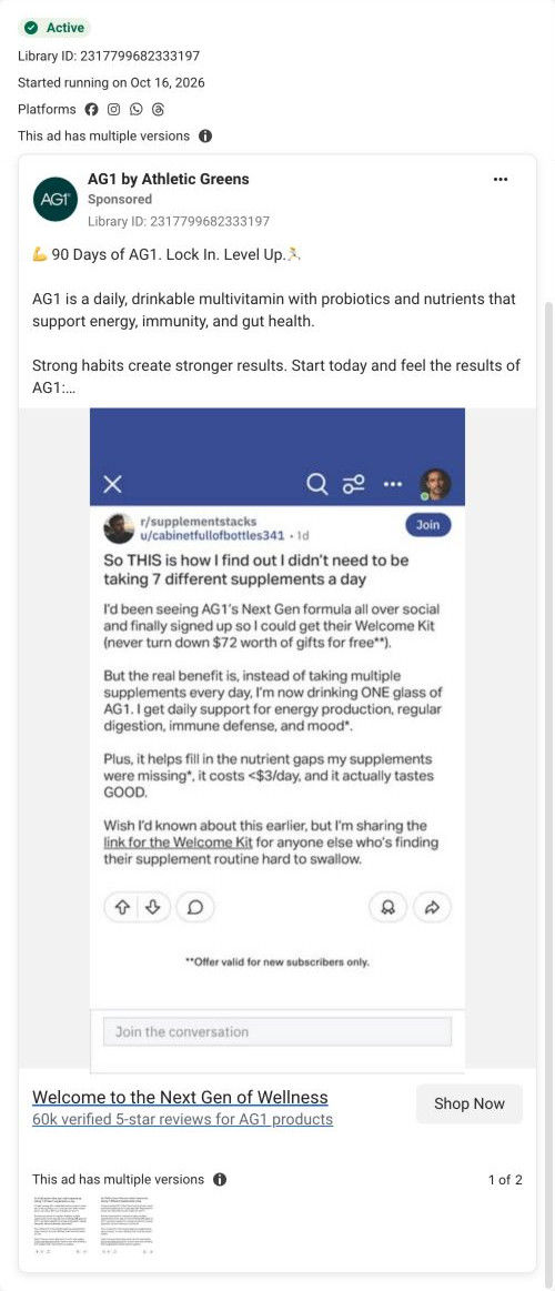
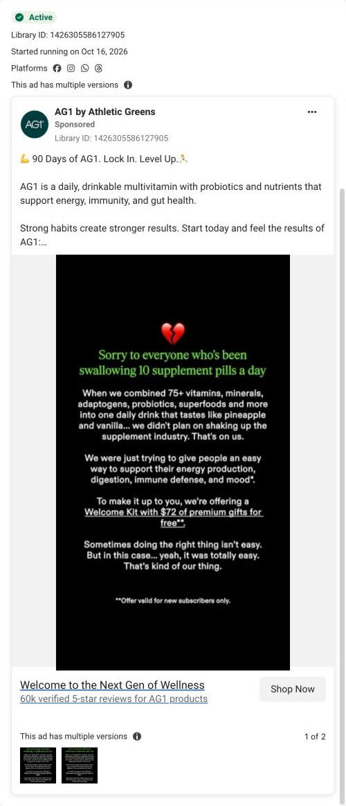
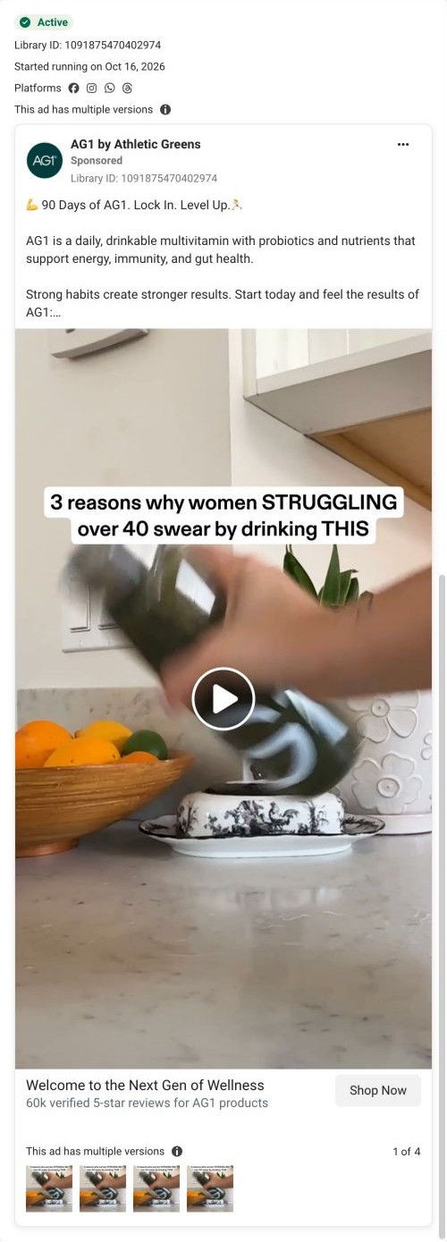
The copy doesn't deliver what the caption promises. It's the same 90-day habit text AG1 runs across several Next Gen ads, with no mom, no age and no three reasons, so someone who read the copy for the list finds a generic pitch. (We captured only the opening frame, so we can't say what the video itself covers.) If you use a listicle hook, make the copy list the same three reasons in plain words, each tied to a moment in that person's day. Then the hook, the copy and the page all keep the promise.
Beat by beat
- 0-3s
The listicle caption over a scoop of powder pouring into a glass of water.It promises a list and shows the product being made.
- Copy
90 Days of AG1. Lock In. Level Up., with AG1 described as a drinkable multivitamin with probiotics.It says what the product is and frames it as a habit.
- Copy
Three percentages the copy footnotes to a self-reported, single-arm study of 104 adults over three months.It gives the ad's claims numbers, with the source in the footnote.
- Headline
Card text: Welcome to the Next Gen of Wellness, with a 60k verified 5-star reviews line.It adds social proof next to the tap.
Where it sends people
It links to the AG1 Next Gen product page, a product page rather than a focused landing page. Below the buy box the page stays in education mode, with a comparison table against multivitamins, probiotics and greens, a per-scoop nutrition table and study-result stat blocks that pick up the percentages in the copy. A What to expect carousel of timed milestones in the buy column fits the 90-day framing. Nothing on the page speaks to the mom or her age, though, so the person the hook named disappears after the click.
The page it sends people to: How AG1's Next Gen product page sells above and teaches below
AG1's Next Gen product page lets the buy box carry the welcome-kit offer and uses everything below it to educate: a category comparison table, per-scoop nutrition, an ingredient carousel, study results, reviews and FAQ. Six education ads in the Fluid library land here, most headlined "90 Days of AG1. Lock In. Level Up."
How the page is built
- 01
Ticker bar and headerA scrolling highlights strip sits above the header and breadcrumb.
- 02
Buy box galleryThe main image carries a ranking badge, a + Free welcome kit overlay and two trust chips, answering what do I get and can I trust it.
- 03
Buy box plansThe longer supply is pre-selected under a Best Value plus free-kit header with per-serving price and kit thumbnails, answering which plan should I choose.
- 04
Buy-column proofA subscription-includes box and a Why They Love customer video carousel add proof at the decision point.
- 05
Upsell and detailsA premium upsell card, five accordions, a What to expect milestone carousel and testing badges, answering when will I notice something.
- 06
Comparison tableThe product is set against multivitamins, probiotics and greens across seven nutrient categories, answering why this instead of what I already take.
- 07
Per-scoop nutritionAn eight-row nutrition table and supplement-facts button sit beside a scoop photo.
- 08
Ingredient carouselLarge ingredient photo cards with one-line descriptions, then free-of and certification columns.
- 09
Study resultsThree large stat blocks with a footnote, answering is there research behind it.
- 10
ReviewsA count headline and three written review cards.
- 11
FAQ and blogTen accordions and a blog carousel handle remaining questions.
- 12
FooterLink columns, newsletter, socials, disclaimers and footnotes.
The first fixes we would make
- All six ads take an education angle, but the visitor lands on a plan choice before any teaching. Send these ads to a lander that sets up the need first (AG1's gummies parent lander puts a problem paragraph ahead of the buy box) and keep this page for shoppers who are ready.
- Written reviews sit near the bottom, after the study results. Pull the review count and two or three quotes up beside the What to expect carousel, so the timeline and the proof sit together.
Read the full breakdown of this page
Three hooks you could test
- Show a specific moment of use. “Why my dad mixes this before his morning walk.”
- Sell the outcome. “Afternoons without the 3 p.m. crash, at 56.”
- Lead with the uncomfortable problem. “Tired by lunch, every single day?”
What to borrow for your brand
- Open with a numbered-reasons caption that names a specific person and age, so the audience recognizes itself without being labeled.
- Show the product being prepared in the first frame so the format is clear before the reasons start.
- Make the copy list the same reasons the caption promises, so the hook and the text tell one story.
One of 65 AG1 ads in the Fluid Inspiration Library, captured from the Meta Ad Library on Oct 19, 2026. We record that an ad ran publicly, not how it performed.