How AG1 put Next Gen into Devri Garland's kitchen routine
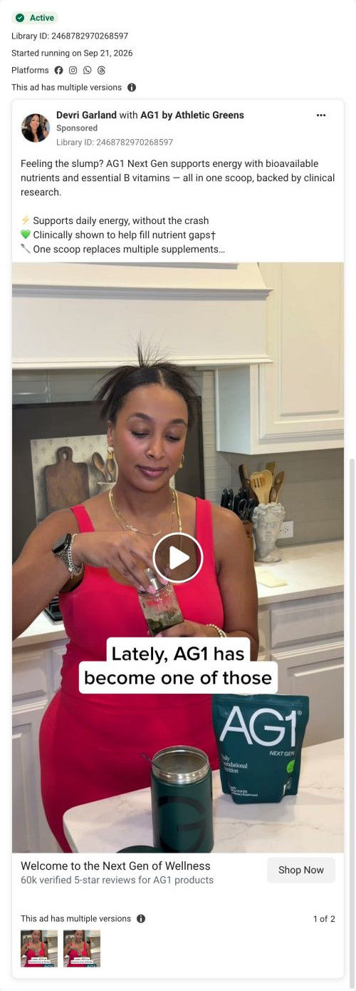
A video ad for AG1 Next Gen that ran on Meta from Sep 21, 2026 as a partnership post with creator Devri Garland. The opening frame shows her shaking a green drink at her kitchen counter beside the pouch and canister. The copy opens on an energy slump, lists three free gifts, and links to a Next Gen offer page.

A browser shopping-extension badge appears in the upper-right margin of this capture.

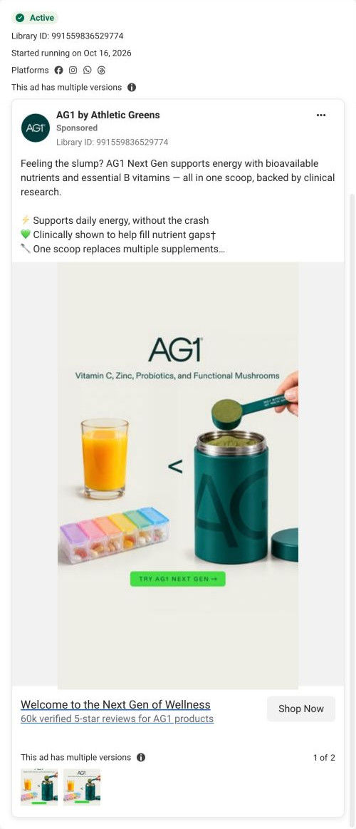
Welcome to the Next Gen of Wellness
An energy-slump hook introduces the benefits advertised for AG1 Next Gen before listing the subscription gifts. The CTA leads to the brand’s green-powder offer route. Compare the creative with the destination and explore the other ads sharing this route.
- Brand
- AG1
- Observed offer
- New subscribers: 3 free travel packs, D3+K2 drops, canister and shaker
- Creative angle
- Starter kits
- Page type
- Dedicated offer
- Ad format
- Video
- Listed start date
- Sep 21, 2026
- Captured
- Oct 19, 2026
- Library ID
- 2468782970268597
- Destination
- drinkag1.com
Selected for its design and offer structure. Ad performance isn’t available in this collection.
What this ad does well
The first frame shows the product inside a real home routine: Devri Garland mid-shake at a marble counter, with the Next Gen pouch and the canister (one of the free gifts) in frame. The caption starts a sentence it doesn't finish, saying AG1 has lately become one of those, which makes you wait for the rest. The copy opens on a familiar feeling (Feeling the slump?) and stacks three free gifts as separate check lines, so the first subscription reads as a bundle.
What's missing
From what we captured, the gifts and the slump problem only live in the copy, and the visible copy cuts off after the third benefit line, before the offer. Someone watching without expanding the text sees a nice routine but no problem and no reason to subscribe today. If you make one like this, have the creator mention the gift on camera or add it as a caption near the end, and let her say the slump moment in her own words so the hook and the video match.
Beat by beat
- Opening frameDevri Garland shakes a jar of green drink at a white marble counter, with the Next Gen pouch and canister in frame.
It shows the product inside a real home routine, with a gift item visible.
- Opening frameA caption begins a thought about AG1 becoming one of those things.
An unfinished line pulls viewers into the next sentence.
- CopyFeeling the slump?, then the ad's claims about B vitamins, daily energy and one scoop replacing multiple supplements.
It names a common feeling and offers the product as the answer.
- CopySubscribe now and get three free travel packs, D3+K2 drops and a canister and shaker, for new subscribers.
It stacks gifts to lower the barrier to a first subscription.
- HeadlineWelcome to the Next Gen of Wellness, with 60k verified 5-star reviews for AG1 products.
It adds review volume at the click.
The offer
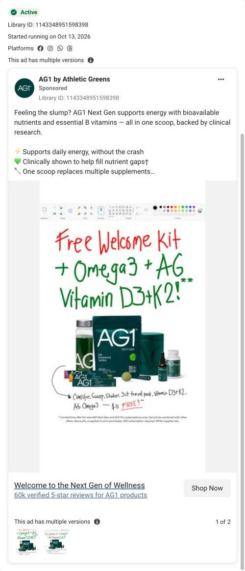
New subscribers get three free travel packs, free Vitamin D3+K2 drops and a free canister and shaker, listed in the copy below the fold.
Where it sends people
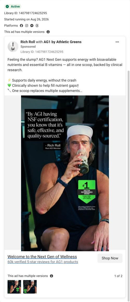
The ad goes to a dedicated offer page built around the free welcome kit, a stronger handoff than a basic product page. The kit is pictured in the hero, named on the early buttons and shown again inside the pre-selected plan card, so the copy's gift list carries straight through. A Replaces your daily checklist backs the one-scoop claim, and a customer video carousel in the buy section continues the creator format. It's one of six ads in the Fluid library that point to this page, alongside a static version of the same copy with Rich Roll.
The page it sends people to: How AG1's Next Gen offer page keeps the free welcome kit in view
AG1's Next Gen offer page is built around a free welcome-kit gift. A split hero pictures the kit, short proof blocks follow, then a full buy box pre-selects the longer plan that carries the gift. Ingredients, a category comparison, endorsements and a guarantee band close it. Six ads in the Fluid library land here, four of them starter-kit ads.
How the page is built
- 01Announcement bar
A free welcome-kit line with a small button sits above minimal navigation, confirming the offer before the hero loads.
- 02Split hero
A pack shot with a free-gift callout picturing the kit sits beside a problem-framed headline, a gift-claim button, a guarantee line and six check benefits, answering what am I getting and why.
- 03Review cards
Three quote cards with stars, titles and dates answer whether people like it.
- 04Routine replacement
A Replaces your daily checklist names five supplement types beside a product photo, answering what this would let me stop buying.
- 05Study stats
Three large study-result numbers with footnotes sit above another gift button, answering whether the claims have research behind them.
- 06Buy box
The gift image returns beside two plan cards, the longer one pre-selected with gift thumbnails inside the card, answering which plan gets me the kit.
- 07Below the plans
Add to Cart, a buy-once link, subscription perks, a customer video carousel and product accordions handle the last questions in the buy column.
- 08Ingredients
A dark band of ingredient category cards ends with free-of and certification columns, answering what's in it.
- 09Category comparison
The product column is highlighted against three single-category supplement types, followed by a Get Started button.
- 10Endorsement carousel
Athlete, expert and celebrity cards each carry a name, quote and role, answering who else trusts it.
- 11Guarantee band
A dark photo band with a shield icon ends on a Try It Risk Free button, answering what if it doesn't work for me.
- 12Footer
Disclaimers, footnotes, a newsletter field and a locale selector close the page.
The first fixes we would make
- The capture shows a large blank area after the category comparison table, likely a block that didn't load. Check it on mobile and desktop, because a gap in the middle of a sales page reads as a broken site.
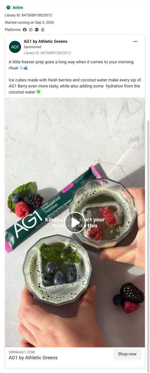
- One ad sells a freezer-prep use occasion, and nothing on the page shows that moment. Either add a short how-to-use block with the freezer idea, or send that ad to a page built around recipes.
Read the full breakdown of this page
Three hooks you could test
- Show a specific moment of use. “Shaken at the counter while the kids find their shoes.”
- Lead with the uncomfortable problem. “Hit a wall every day around 2pm?”
- Call out the habit you're replacing. “Swapped the cabinet full of bottles for one canister.”
What to borrow for your brand
- Open a creator video on an unfinished sentence, so the caption itself gives people a reason to keep watching.
- Film your product next to the gift items customers will receive, so the bundle is visible in use and not only listed.
- Run the same copy on a static endorser image and a creator video, so you can compare formats while the offer stays the same.
One of 65 AG1 ads in the Fluid Inspiration Library, captured from the Meta Ad Library on Oct 19, 2026. We record that an ad ran publicly, not how it performed.