

AG1 by Athletic GreensSponsored
Esc
How AG1's homepage works as a product chooser for ad traffic
AG1's homepage works as a product chooser. A launch hero, three tier cards and a full comparison table come first, followed by a goals block, customer videos, ingredients, quality standards, value math, endorsements and a guarantee band. Five ads in the Fluid library link here, spanning use-occasion, creator story, launch and problem-led angles.
AG1
5 creatives lead here1 / 5

The AG1 homepage
A browser shopping-extension badge appears in the upper-right margin of this capture.

The AG1 homepage
AG1's homepage works as a product chooser. A launch hero, three tier cards and a full comparison table come first, followed by a goals block, customer videos, ingredients, quality standards, value math, endorsements and a guarantee band. Five ads in the Fluid library link here, spanning use-occasion, creator story, launch and problem-led angles.
- Brand
- AG1
- Page type
- Homepage
- Ads leading here
- 5
- Captured
- Oct 19, 2026
- Destination
- drinkag1.com
Selected for its design and offer structure. Ad performance isn’t available in this collection.
What this page does well
For a homepage, it gets visitors to a decision quickly. Right after the hero, three product cards sit side by side with the middle one dark-filled and tagged Most Popular, each with monthly and per-serving price and a benefit checklist, so visitors can pick a lane before any deep content. A full check-and-cross comparison table follows immediately and ends in price rows, which settles which tier to buy. Proof then arrives in layers down the page (customer videos, press logos, an endorsement carousel, written reviews), and a full-bleed guarantee band naming the risk-free window sits right before the FAQ, where the last doubts usually come up.
How the page is built
- 01Ticker and hero carousel
A launch slide with one CTA sits above a trust strip of four badges (certification, research, expert backing, risk-free guarantee), answering why should I trust this brand.
- 02Product range
Three product cards, the middle one tagged Most Popular, show price and a benefit checklist, answering which one is for me.
- 03Comparison table
Three product columns run through format, ingredient count, certification and ingredient checks, ending in price rows, answering what's the difference between them.
- 04Goals block
Five a-formula-for-you-if bullets and a Get Started button sit beside lifestyle photos, answering does this match what I want.
- 05Customer videos and press
A customer-count headline, three video testimonials and three publication logos answer who else uses it.
- 06Ingredients carousel
Photo cards per ingredient category scroll on a dark band, answering what's in it.
- 07Quality standards
An athlete photo with a certification badge sits beside copy on third-party testing, answering is it safe and tested.
- 08Value math
A table prices each supplement category bought separately against the products' monthly totals, then a Compare Products prompt, answering is it worth the money.
- 09Endorsements and reviews
An athlete, expert and celebrity carousel is followed by three written reviews.
- 10Featured products
A launch banner sits above a four-card grid tagged Best Seller, Enhanced and New.
- 11Guarantee band
A full-bleed band names the risk-free window and support contact and ends on Try It Risk Free, answering what if it doesn't work for me.
- 12FAQ, blog and footer
Eight accordions, a blog carousel and a long footer close the page.
What's missing, in the order we'd fix it
- Five very different ads land on the same general first screen, which is the weakest rung on the landing-page ladder. Start with the problem-led ad and send it to a page that opens on the value math table, since that table is the direct answer to its question.
- The creator ad features Cleetus McFarland, and nothing on the homepage mentions him. Give creator ads a page, or at least a hero slide, that picks up the creator's story.
- The value math table sits seven sections below the hero, though it's the strongest answer to price objections on the page. Move it up beside the comparison table so visitors see the savings while they're choosing a tier.
How the ads set it up
The five ads cover very different hooks, from a Cleetus McFarland creator story to "How many supplements are in your cabinet right now?", and none gets a tailored first screen. The page relies on the tier cards and comparison table to let each visitor sort themselves out, which is the best a homepage can do, but it means the problem the ad raised doesn't get answered until the value math table much further down. If you're running ads with distinct angles, each one deserves a page that opens on the question it asked.
What to borrow for your brand
- Put three tier cards right after the hero, with the middle one dark-filled and tagged Most Popular, so visitors pick a lane early.
- Follow the cards with a full check-and-cross comparison table that ends in price rows, so the choice is settled in one place.
- Stack proof in layers down the page (videos, press, endorsements, written reviews) and place a full-bleed guarantee band just before the FAQ.
Ads that send people here
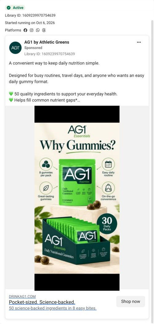
- How AG1 answered Why Gummies? with four icons and a box
- How AG1 paired Hugh Jackman with Cleetus McFarland on a phone call
- How AG1 Pro's creator video shows two tubs becoming one pack
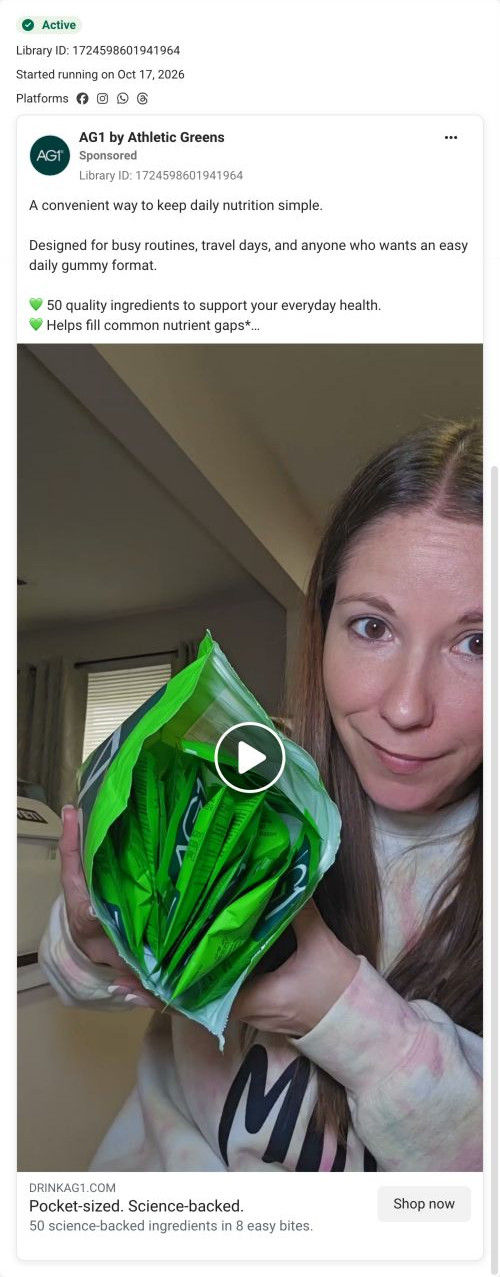
- How AG1's gummies video opens on a bag stuffed with single packs
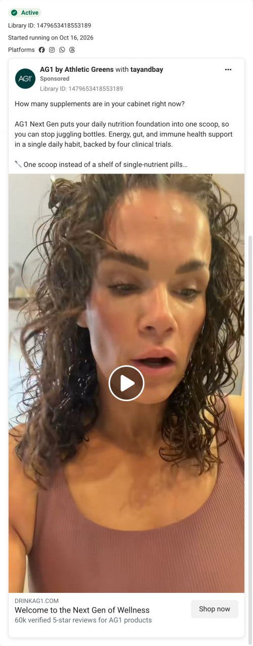
- How AG1's cabinet question ad makes you count your own supplements
Captured from drinkag1.com in October 2026 for the Fluid Inspiration Library. Offers and prices change; this is what the page showed when we captured it.