

Shawn Johnson East with AG1 by Athletic GreensSponsored
Esc
How AG1's gummies product page lets the gallery do the selling
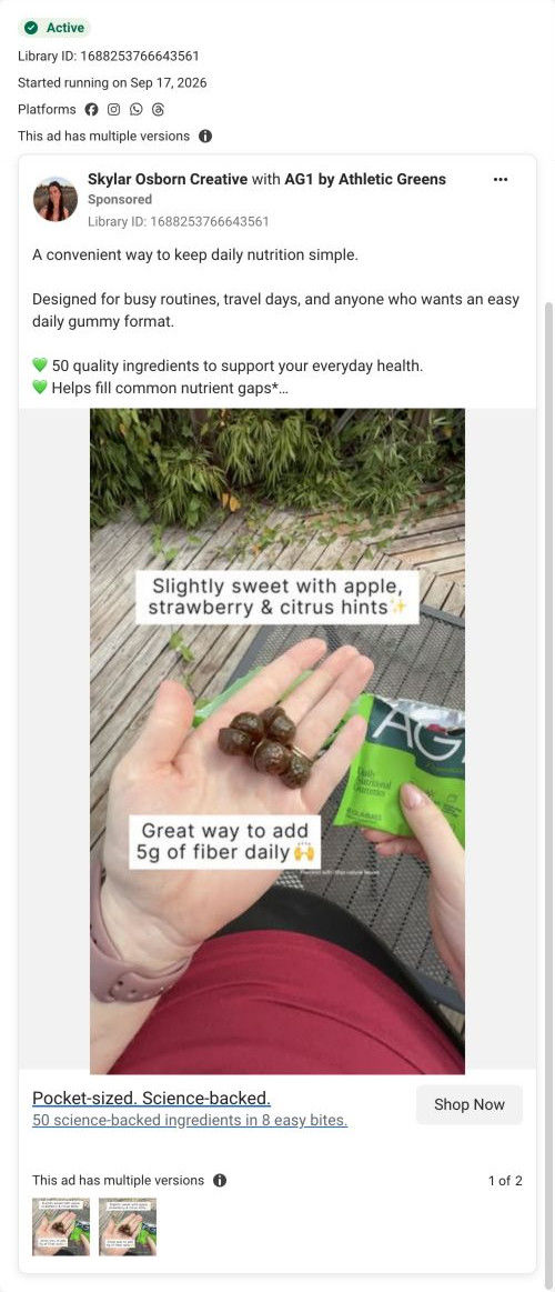
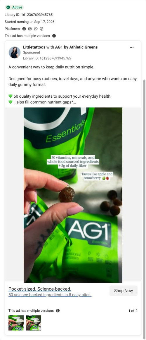
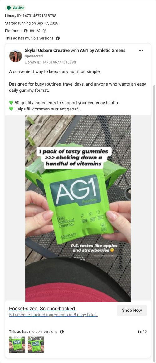
AG1's Essentials Gummies product page pairs a left-column grid of infographic tiles with a right-column plan selector, then adds a flavor band, a replace-the-stack cost table, creator videos, reviews, ingredients and quality proof. Eleven ads in the Fluid library send people here, eight of them creator-led and headlined "Pocket-sized. Science-backed."
AG1
11 creatives lead here1 / 11


AG1 Essentials Gummies
A browser shopping-extension badge appears in the upper-right margin of this capture.

AG1 Essentials Gummies
AG1's Essentials Gummies product page pairs a left-column grid of infographic tiles with a right-column plan selector, then adds a flavor band, a replace-the-stack cost table, creator videos, reviews, ingredients and quality proof. Eleven ads in the Fluid library send people here, eight of them creator-led and headlined "Pocket-sized. Science-backed."
- Brand
- AG1
- Page type
- Product page
- Ads leading here
- 11
- Captured
- Oct 19, 2026
- Destination
- drinkag1.com
Selected for its design and offer structure. Ad performance isn’t available in this collection.
What this page does well
AG1 lays the gallery out as an open grid of infographic tiles instead of a slider, so benefits, flavor, the nutrition panel, a cost comparison and key ingredients are all visible without clicking through images. Beside it, two plan cards are sold by supply length, with the longer one pre-selected and tagged Best Value, showing per-serving cost and four perks, while one-time purchase is demoted to a text link under Add to Cart. A beige box right under the button lists the subscription perks (free shipping, guarantee, rewards, pause or cancel), which answers the usual subscription worries at the moment of decision. Since creator ads bring in most of the traffic, the three creator video cards and a review carousel come right after the cost table, high on the page.
How the page is built
- 01Announcement ticker
A scrolling line promotes other product launches above the page.
- 02Infographic gallery
A large tile with benefit checks and a flavor ribbon sits above six tiles covering flavor, nutrition, cost, ingredients and lifestyle, answering what is this and why should I care.
- 03Plan selector and cart
Two supply-length plan cards, the longer pre-selected with per-serving cost, sit above Add to Cart, a Buy Once link and four subscription perks, answering what's the best way to buy.
- 04Buy-column accordions
Accordions cover what it is, who it's for, benefits, how to use and quality, with a testing badge and HSA/FSA strip, answering the detail questions without leaving the buy box.
- 05Flavor band
A bright full-width block pairs a product-and-fruit image with a large headline about taste, answering will I actually like eating these.
- 06Replace the Stack table
The product column is set against separate supplement categories with a monthly cost for each and a total, answering is this worth the price.
- 07Creator videos
Three vertical video cards with first names sit beside a rating line, answering what do real people say about it.
- 08Review carousel
Three short written reviews add a second layer of customer proof.
- 09Ingredients
A dark band of ingredient cards ends with excluded allergens and additives and two certification statements, answering what's in it and what isn't.
- 10Routine steps
Three photo cards show opening the pack, eating and taking it anywhere, answering how does this fit my day.
- 11Nutrition and quality
A nutrition table and an athlete photo with a certification overlay answer whether the quality holds up.
- 12FAQ, blog and footer
Accordions compare formats and cover flavor and serving count, followed by article cards and the footer.
What's missing, in the order we'd fix it
- The announcement ticker promotes other product launches, which pulls a visitor who came for gummies toward something else on the first screen. Use that line for the gummies offer or guarantee instead.
- Two launch ads frame the gummies against other gummies, but the page only compares formats inside an FAQ accordion. Add a small table against ordinary gummies after the flavor band (AG1 already uses one on its gummies landers) so that comparison is visible.
- There's no timeline of what to expect after the first pack. A short section near the creator videos, or a line in the plan cards, would answer when people should expect to notice a difference.
How the ads set it up
Eight of the eleven ads are creator-led, and the page answers them with creator video cards and a review carousel right after the cost table, while the first screen stays product-led with the tile gallery. The pocket-sized angle is paid off by the routine steps that show the pack going anywhere. The two launch ads lean on the gummy category itself, and that comparison only appears in an FAQ accordion, so that's the one ad angle that doesn't get a visible section of its own.
What to borrow for your brand
- Lay your gallery out as an open grid of infographic tiles, so benefits, flavor and cost are visible without anyone clicking through a slider.
- Sell two plans by supply length, pre-select the longer one with a Best Value tag and per-serving cost, and demote one-time purchase to a text link.
- When creator ads drive most of your traffic, put creator video cards high on the page, right after your first proof section.
Ads that send people here
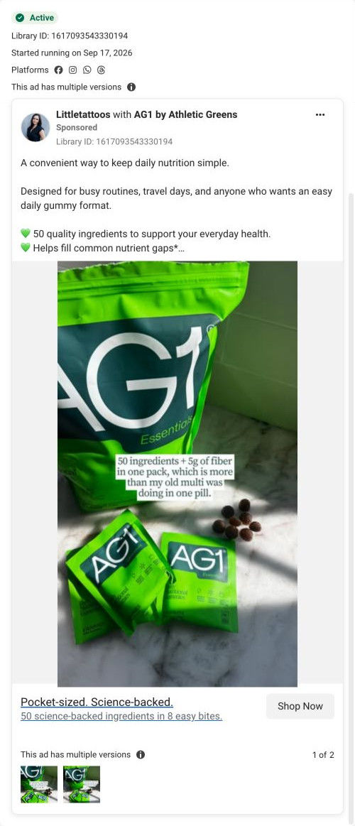
- How AG1 launched its gummies with Shawn Johnson East's taste test
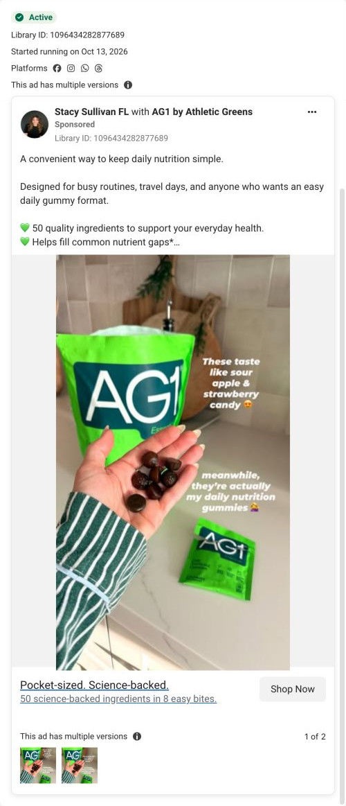
- How AG1 introduced its gummies with a palm, a pouch and taste notes
- How AG1 sold its gummies with one gummy held up close
- How AG1 recut a creator launch video around the greens-taste objection
- How AG1 showed its gummies in one hand in a 5-second clip
- How AG1's gummies ad pits one tasty pack against a handful of pills
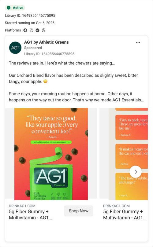
- How AG1 turned customer reviews into a gummies carousel
- How AG1's gummies ad uses a creator's old multivitamin as the foil
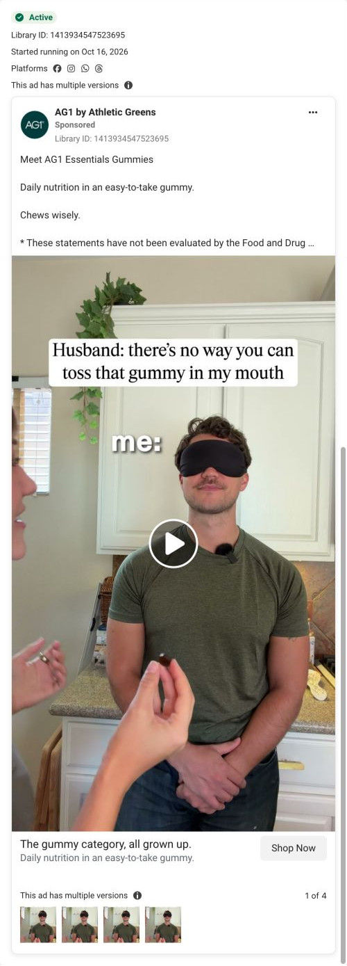
- How AG1 used a blindfolded gummy toss to launch Essentials
- How AG1's gummies ad sets up candy and reveals daily nutrition
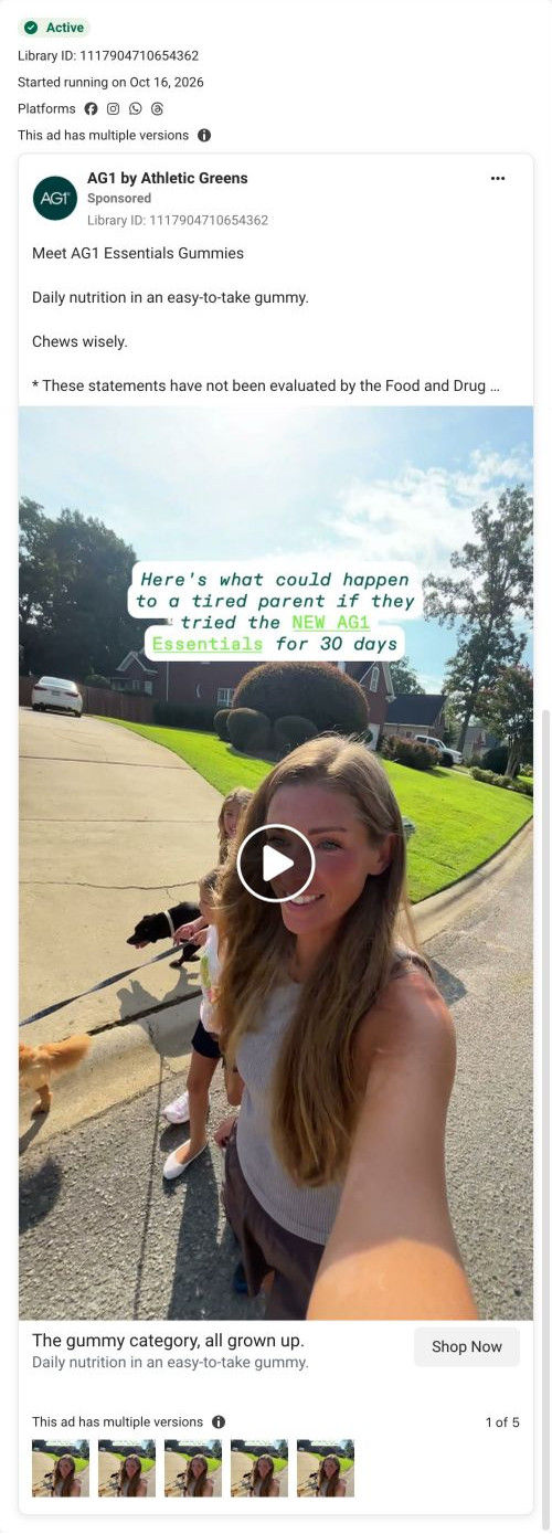
- How AG1 launched Essentials gummies with a tired parent's 30 days
Captured from drinkag1.com in October 2026 for the Fluid Inspiration Library. Offers and prices change; this is what the page showed when we captured it.