The Absorption CompanySponsored
Esc
How The Absorption Company leads a WLP-1 ad with a skeptic's review
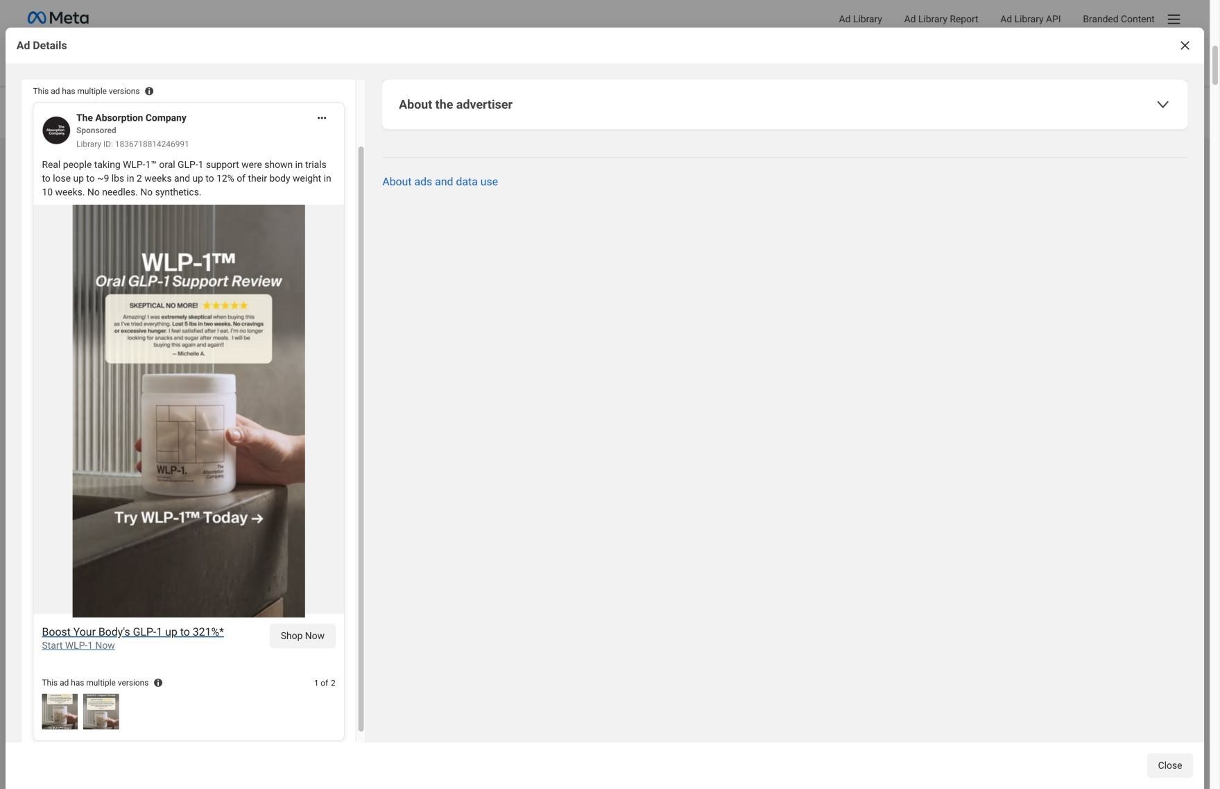
A static image styled as a product review: 'WLP-1 Oral GLP-1 Support Review' above a five-star quote card from Michelle A. titled 'Skeptical no more!', with a hand holding the jar and 'Try WLP-1 Today.' The copy cites trial weight figures, as the brand states them. There's no discount. It sends people to the WLP-1 product page.
The Absorption Company
30 creatives lead here1 / 30
WLP-1 · product offer
Captured directly from Meta and the linked page on October 20, 2026. Live offers may change.

Boost Your Body's GLP-1 up to 321%*
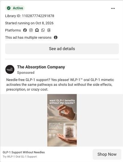
A monochrome bottle layout places a customer-review quotation above the product. Product benefits lead into subscription plans, gifts, a goal calculator, testimonials, and ingredient research. Compare the creative with the destination and explore the other ads sharing this route.
- Brand
- The Absorption Company
- Observed offer
- Boost Your Body's GLP-1 up to 321%*
- Creative angle
- Customer review
- Page type
- Product page
- Ad format
- Image
- Listed start date
- Oct 12, 2026
- Captured
- Oct 20, 2026
- Library ID
- 1836718814246991
- Destination
- absorbmore.com
Selected for its design and offer structure. Ad performance isn’t available in this collection.
What this ad does well
Leading with a skeptic's review answers the first doubt a viewer has about a GLP-1 supplement before the brand says anything itself. 'Skeptical no more!' works as a hook on its own, and the quote underneath adds specifics in the customer's words (she says she lost 5 lbs in two weeks and stopped reaching for snacks after meals). The muted, monochrome photo keeps attention on the quote and the jar. The Absorption Company ran it in more than one version from Oct 12, 2026.
What's missing
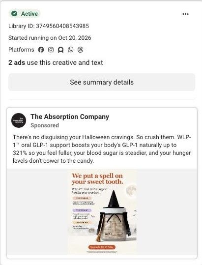
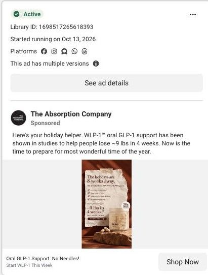
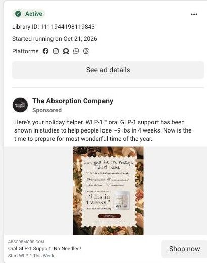
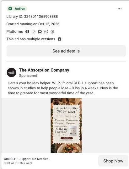
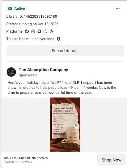
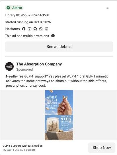
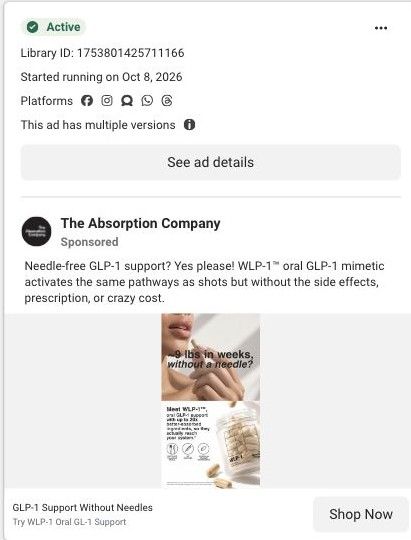
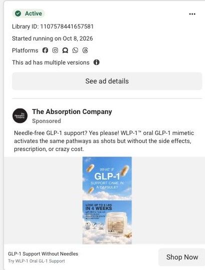
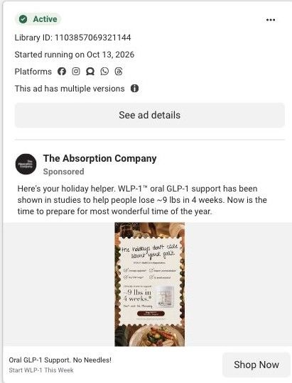
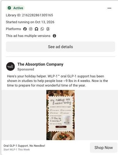
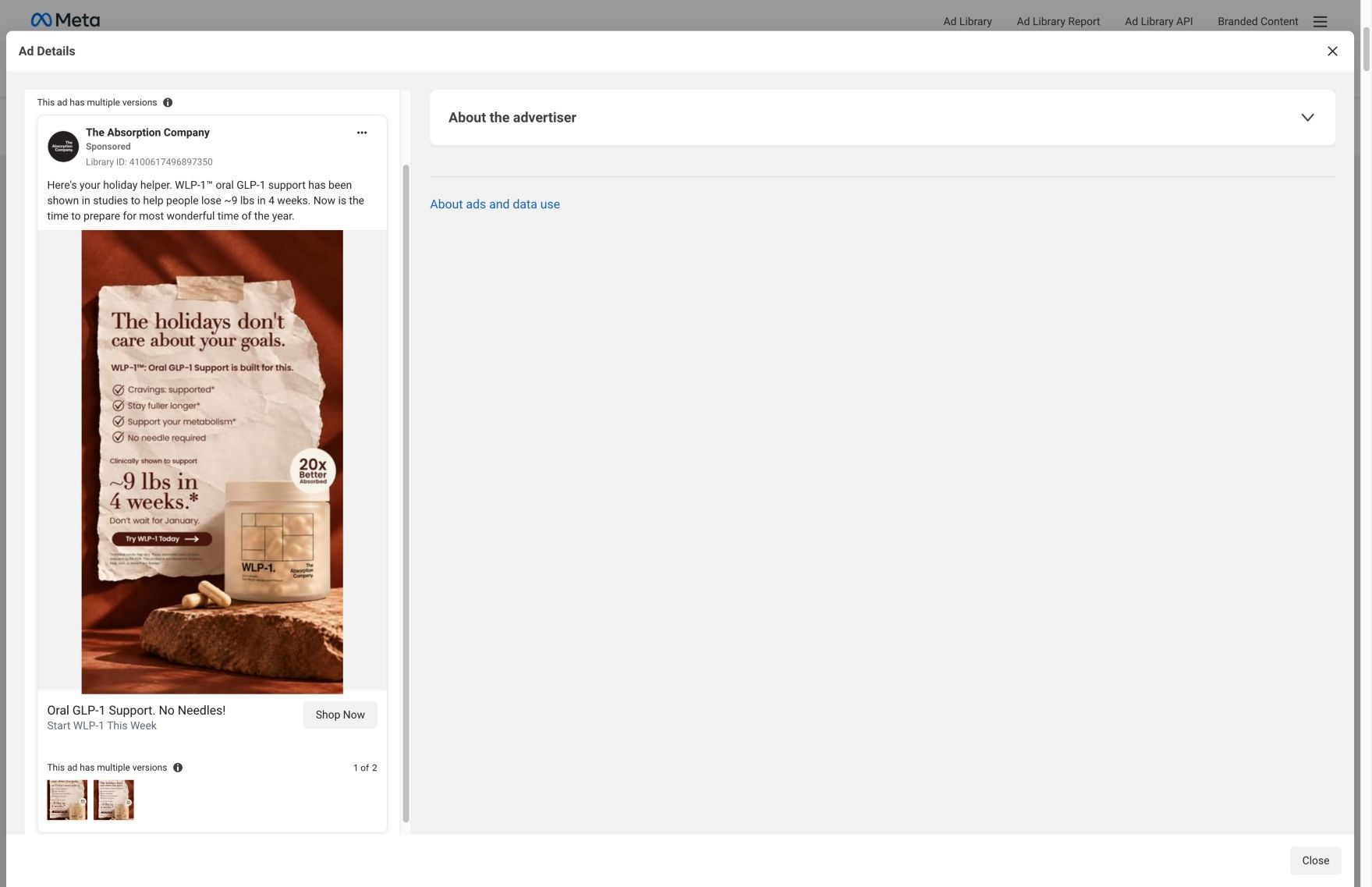
The copy stacks bigger numbers on top of the review (up to about 9 lbs in 2 weeks and up to 12% of body weight in 10 weeks, as it states them), and those don't line up with the brand's holiday static, which says about 9 lbs in 4 weeks. Mixed figures across ads make a careful buyer trust all of them less. If you make one like this, let the customer quote carry the ad, keep any study figure identical everywhere and say where it comes from, and add a reason to try now such as a guarantee.
Beat by beat
- ImageA hand holds the WLP-1 jar on a concrete ledge in front of ribbed glass, with 'Try WLP-1 Today' below.
A real hand and a quiet, muted setting make the product feel tangible and calm.
- Headline'WLP-1 Oral GLP-1 Support Review' over a five-star card headed 'Skeptical no more!' and signed Michelle A.
Framing the ad as a customer review lets a buyer's voice make the case.
- CopyThe post says people in trials lost up to about 9 lbs in 2 weeks and up to 12% of body weight in 10 weeks, with no needles or synthetics, as the brand claims.
It adds study numbers to back the single review, though they need to match the brand's other ads.
The offer
No discount. The headline 'Boost Your Body's GLP-1 up to 321%*' and 'Start WLP-1 Now' frame the click.
Where it sends people
It links to the WLP-1 product page, the basic end of the ladder, but one with the right sections for a review-led ad: 'What Others Are Saying,' 'Backed by Experts,' 'Clinical Trials' and customer reviews, after the plan selector. A visitor who clicked because of Michelle's review will find more reviews waiting, which is good message match. Putting a review near the plan options, instead of further down, would keep that thread unbroken. Thirty ads in the Fluid library point to this page.
The page it sends people to: How The Absorption Company built its WLP-1 product page
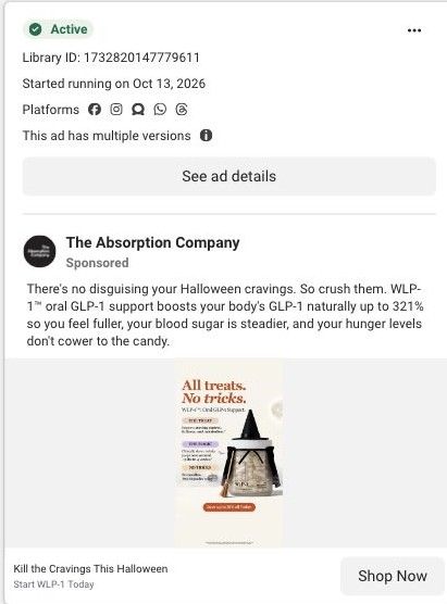
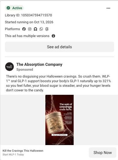
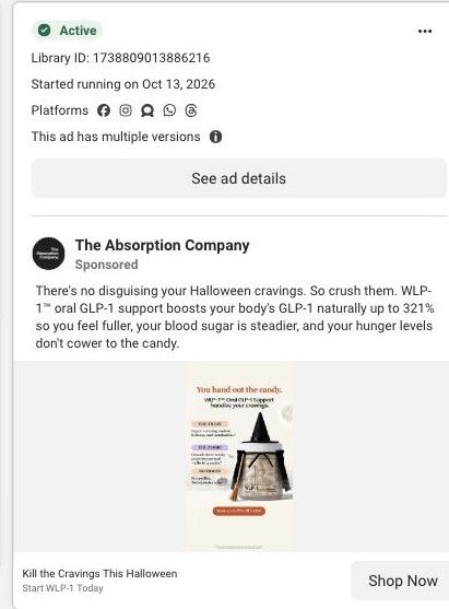
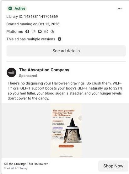
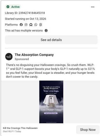
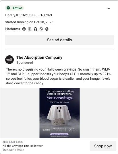
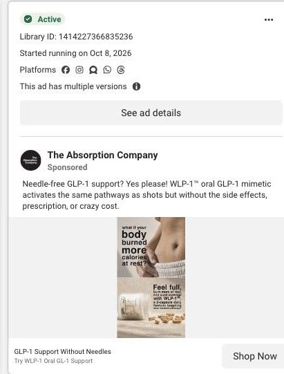
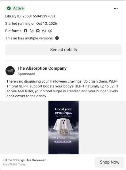
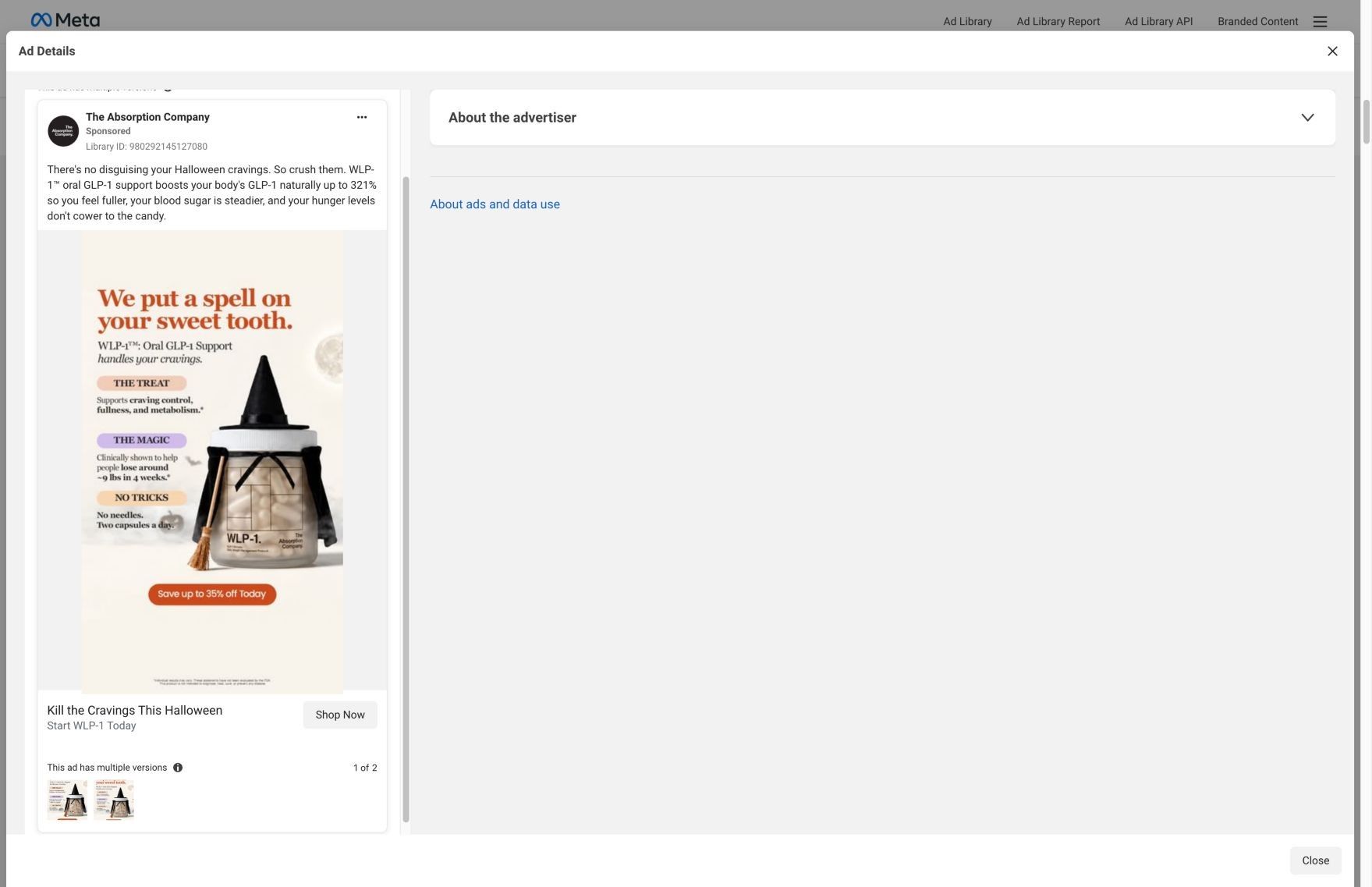
The Absorption Company's WLP-1 product page, pitched as oral GLP-1 support, with a claims strip, a 70-Day Challenge gift offer, subscription plans, video testimonials, clinical study cards and a stack upsell. 30 Absorption Company ads in the Fluid library link here, led by Halloween cravings statics and "no needles" comparison statics.
How the page is built
- 01Gallery and claims
Shows the jar beside the product name, rating and claimed outcomes, answering what WLP-1 is and what it's said to do.
- 02Plan picker and challenge
Offers 3 Months, 6 Months and Monthly with savings, free gifts and the 70-Day Challenge, answering what it costs and why to subscribe.
- 03Why WLP-1 Works
Explains the brand's mechanism claims, answering how the product is supposed to work.
- 04Over-time section
Describes what the brand says changes over time, answering when to expect anything.
- 05Video testimonials
Shows vertical videos with each reviewer's name and time on the product, answering what real users say.
- 06Expert proof
An expert quote card with a headshot and a clinicians' choice badge, answering whether professionals back it.
- 07Clinical trials
Quotes study findings as sourced cards, answering what evidence the claims rest on.
- 08Stack upsell
Asks why stop at three metabolic pathways, answering what to add and raising order size.
- 09Pairs Well With and reviews
Suggests complementary products and collects customer reviews, answering what else to buy and what buyers say.
The first fixes we would make
- The Halloween ads promise a seasonal moment, and the page only carries a generic fall special. Add a seasonal banner or hero line that repeats the ad's cravings-at-Halloween idea so the visitor knows they found the offer they clicked.
- The "no needles" comparison ads set up a contrast that this page never draws. Add a short capsule vs. injection comparison near the plan picker, using the brand's existing comparison copy from its advertorials and keeping every claim attributed and sourced.
Read the full breakdown of this page
Three hooks you could test
- Lead with the uncomfortable problem. “Skeptical? So was every one of our reviewers.”
- Show a specific moment of use. “Two weeks in, I stopped reaching for snacks after dinner.”
- Make the product the whole scene. “Just the jar, a hand and a five-star review.”
What to borrow for your brand
- Pick a review that starts with doubt ('I was extremely skeptical') and make it the headline, because it answers the viewer's own hesitation.
- Keep the photo quiet and monochrome so the review card is the first thing people read.
- Use one set of study numbers across every ad and page, and cite the source, so your proof reinforces itself instead of conflicting.
One of 188 The Absorption Company ads in the Fluid Inspiration Library, captured from the Meta Ad Library on Oct 20, 2026. We record that an ad ran publicly, not how it performed.