Kelly.rebelwhitecoat with The Absorption CompanySponsored
Esc
How The Absorption Company positions magnesium against melatonin
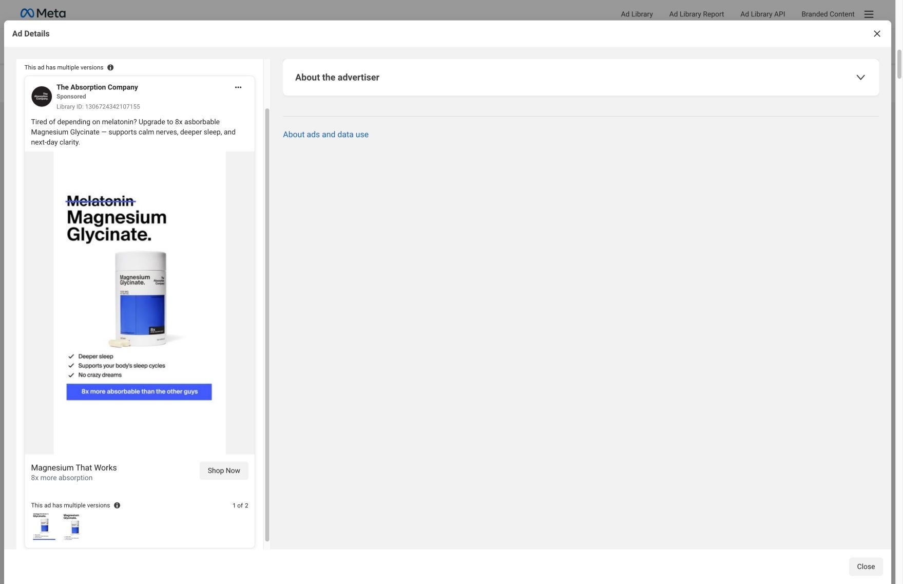
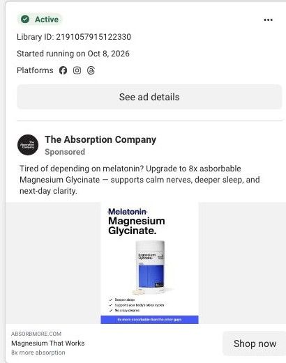
A minimal static image with 'Melatonin' crossed out above 'Magnesium Glycinate.', the blue-labeled bottle, three checkmarks and a banner reading '8x more absorbable than the other guys.' The copy asks if you're tired of depending on melatonin. There's no discount. It sends people to the Magnesium Glycinate product page.
The Absorption Company
12 creatives lead here1 / 12
Magnesium Glycinate · product offer
Captured directly from Meta and the linked page on October 20, 2026. Live offers may change.

Magnesium That Works
Minimal product artwork crosses out melatonin above the magnesium bottle. Sleep-oriented product messaging continues into subscription choices, benefit explanations, reviews, and complementary products. Compare the creative with the destination and explore the other ads sharing this route.
- Brand
- The Absorption Company
- Observed offer
- Magnesium That Works
- Creative angle
- Comparison
- Page type
- Product page
- Ad format
- Image
- Listed start date
- Oct 8, 2026
- Captured
- Oct 20, 2026
- Library ID
- 1306724342107155
- Destination
- absorbmore.com
Selected for its design and offer structure. Ad performance isn’t available in this collection.
What this ad does well
Crossing out melatonin is a fast, visual way to name the habit being replaced, and anyone with melatonin on the nightstand gets the point in a second. The checklist stays short and concrete (deeper sleep, supports your body's sleep cycles, no crazy dreams), and 'no crazy dreams' is a nice touch because it quietly answers a complaint some melatonin users have. The blue banner gives the one comparison claim, and the layout is clean enough to read at thumbnail size. The Absorption Company ran it in more than one version from Oct 8, 2026.
What's missing
The ad tells people to switch but doesn't show anyone who did, so the only proof is the 8x absorption claim against 'the other guys.' It also gives no reason to switch today. If you make one like this, add a one-line attributed review from someone who moved off the thing you're replacing, and put a first-order offer or guarantee near the CTA.
Beat by beat
- Image'Melatonin' with a line through it sits above 'Magnesium Glycinate.' and the white bottle with a blue label.
The strike-through tells the viewer what this replaces before they read anything else.
- Image checklistThree checks: deeper sleep, supports your body's sleep cycles, no crazy dreams, over a blue bar reading '8x more absorbable than the other guys.'
Short benefits plus one comparison give a reason to switch in a single glance.
- CopyThe post asks if you're tired of depending on melatonin and lists calm nerves, deeper sleep and next-day clarity, as the brand claims.
Framing melatonin as something people 'depend on' gives the switch an emotional push.
The offer
No discount. The link headline 'Magnesium That Works' with '8x more absorption' frames it as an upgrade.
Where it sends people
The ad goes to the Magnesium Glycinate product page, the basic end of the ladder. The blueprint explains why the brand's version is better and how it changes your routine over time, then backs it with experts and reviews. Nothing in the section list speaks to melatonin, though, so the comparison that earned the click isn't continued. A short 'switching from melatonin' block near the top, or a dedicated page, would finish the argument the ad started. Twelve ads in the Fluid library point to this page.
The page it sends people to: How The Absorption Company sells magnesium glycinate for sleep
The Absorption Company's magnesium glycinate product page, pitched for sleep, mood and muscle support, with a research stat strip, a three-plan subscription picker with free gifts, benefits, an over-time section, expert proof, cross-sells and reviews. 12 Absorption Company ads in the Fluid library link here, mainly creator videos about sleep and mood and 8x absorption comparisons.
How the page is built
- 01Gallery and title
Shows the bottle beside the product name, rating and three claimed benefits, answering what this is for.
- 02Research strip
Lists dose, absorption and digestion claims as numbers, answering why this magnesium over another.
- 03Plan picker
Offers 3 Months, 2 Months and Monthly with savings, gifts and the guarantee, answering what it costs and which plan to pick.
- 04Why it works better
Explains the brand's absorption and benefit claims, answering how the product is supposed to work.
- 05Over-time section
Describes what the brand says changes with consistent use, answering when to expect anything.
- 06Expert proof
Shows expert backing, answering whether professionals vouch for it.
- 07Pairs Well With
Suggests complementary products, answering what else to add and raising order size.
- 08Customer reviews
Collects buyer reviews, answering what people say after trying it.
The first fixes we would make
- The sleep ads promise better sleep, but the title splits the promise three ways (sleep, mood and muscle). Lead with sleep for this traffic, either with a sleep-first headline variant or by sending sleep ads to a sleep-specific landing page like the brand's magnesium advertorial.
- The comparison ads promise a contrast with other magnesium, and on this page that answer lives inside a collapsed FAQ. Turn it into a visible comparison table near the research strip (glycinate vs. the forms people already have at home).
Read the full breakdown of this page
Three hooks you could test
- Call out the habit you're replacing. “Cross out [the thing they use now]. Write in [your product].”
- Turn the benefit into a picture people get in a second. “Deeper sleep. No weird dreams. One bottle.”
- Sell the outcome. “Wake up clear-headed instead of groggy.”
What to borrow for your brand
- Strike through the product your buyer uses now and set yours right below it, so the comparison needs no explanation.
- Include one benefit that answers a known complaint about the alternative ('no crazy dreams') to show you understand why people want to switch.
- Keep a comparison static to three checkmarks and one banner claim so it reads at thumbnail size.
One of 188 The Absorption Company ads in the Fluid Inspiration Library, captured from the Meta Ad Library on Oct 20, 2026. We record that an ad ran publicly, not how it performed.