Mary Welch Fox Design with The Absorption CompanySponsored
Esc
Inside The Absorption Company's berberine product page and plan picker
The Absorption Company's standard berberine product page, with a gallery, a stat strip, a three-plan subscription picker with free gifts, benefits, an over-time section, expert proof, cross-sells and reviews. 33 Absorption Company ads in the Fluid library link here, mostly creator testimonial videos built on the 6.2x absorption headline.
The Absorption Company
33 creatives lead here1 / 33
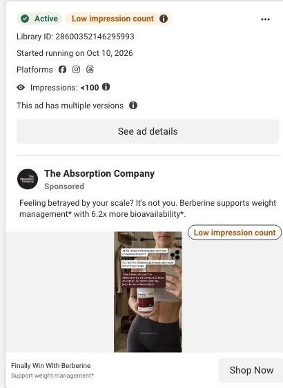
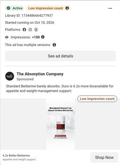
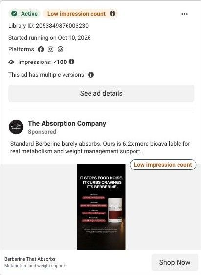
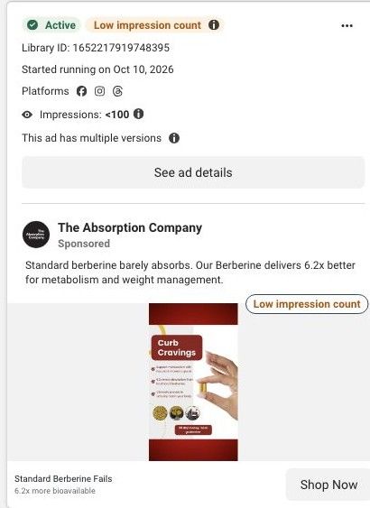
Berberine · product offer
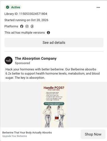
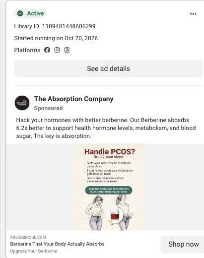
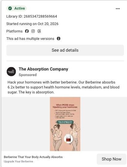
Active ad and exact outbound link observed in Meta Ad Library on October 22, 2026. The page image and section source are the existing October 20 capture of this destination. Offers and product selections may change. Selection reflects creative and page structure; performance is not available.

Berberine · product offer
The Absorption Company's standard berberine product page, with a gallery, a stat strip, a three-plan subscription picker with free gifts, benefits, an over-time section, expert proof, cross-sells and reviews. 33 Absorption Company ads in the Fluid library link here, mostly creator testimonial videos built on the 6.2x absorption headline.
- Brand
- The Absorption Company
- Page type
- Product page
- Ads leading here
- 33
- Captured
- Oct 22, 2026
- Destination
- absorbmore.com
Selected for its design and offer structure. Ad performance isn’t available in this collection.
What this page does well
The buy box does the hard work well. The title names the job ("Daily Metabolic Support"), the rating sits right under it, and a four-number stat strip (1,500 mg, 6.2x, 7x fewer GI complaints, 12-hour release) turns the claims into something you can scan. The plan picker defaults to the 3 Month Supply with a Most Popular badge, a 35% savings tag, the total due today and the dollars saved, and it lists free gifts, free shipping, cancel anytime and the 30-day guarantee under the price. The fall special shows the gifts as product photos with their crossed-out values, which makes the subscription feel like a better deal than a discount line would. Sticky tabs (Benefits, Absorption, What to Expect, Experts, Ingredients, FAQs) and a sticky add-to-cart keep a long page easy to move through.
How the page is built
- 01Gallery and title
Shows the bottle and breakdown images beside the product name and rating, answering what this is and whether people like it.
- 02Stat strip and claims
Lists the dose, absorption and GI-comfort claims in four tiles, answering why this berberine over another.
- 03Plan picker
Offers 3, 2 and 1 month supplies with savings, gifts and the guarantee, answering how much it costs and which option is the best value.
- 04Why it works better
Pairs a lifestyle photo with six benefit tiles and a customer quote, answering what the product is claimed to do.
- 05Over-time section
Lays out what the brand says changes over time, answering when someone should expect to notice anything.
- 06Expert proof
Shows expert backing, answering whether professionals vouch for it.
- 07Pairs Well With
Suggests complementary products, answering what else to add and raising order size.
- 08Customer reviews
Collects buyer reviews, answering what people like you say after trying it.
What's missing, in the order we'd fix it
- Creator testimonial videos send traffic here, but the page has no creator or video testimonial section, so the person who convinced the visitor disappears at the click. Add a strip of short creator clips (the WLP-1 page already has this format) right under the plan picker.
- Customer reviews sit at the very bottom. Pull three short reviews that speak to cravings and energy up beside the benefit tiles, so proof shows up while the visitor is still deciding.
- The headline "Daily Metabolic Support" is broad compared with the ads, which name cravings and absorption. Add a one-line outcome under the title that echoes the ad's promise so the visitor knows they're in the right place.
How the ads set it up
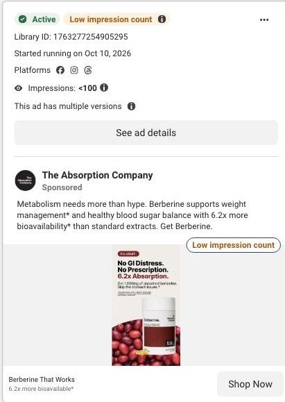
The ads hammer one line in a few phrasings (berberine that absorbs, 6.2x better absorption), and the stat strip repeats that 6.2x figure right next to the price, so the core promise survives the click. What doesn't carry over is the format: these are mostly creator testimonials and routines, and the page switches to a standard product layout with no faces until the reviews at the bottom. The "Nature's Ozempic" video and the cravings-led routine ad also land here with no matching language on the page.
What to borrow for your brand
- Show free subscription gifts as product photos with crossed-out values inside the plan picker, so the subscription feels like getting something rather than just paying less.
- Put a four-number stat strip under your product title so the main claims can be scanned in a second before anyone reads a paragraph.
- Add sticky section tabs on a long product page so visitors can jump straight to the question they have, whether that's ingredients, experts or FAQs.
Ads that send people here
- How a Hashimoto's story sells The Absorption Company berberine
- Why a creator told viewers to stop judging berberine by milligrams
- How a car selfie video sold The Absorption Company berberine
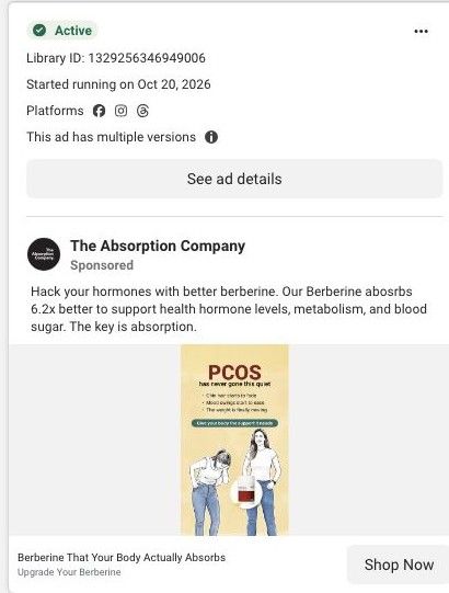
- How a short car video pitched absorbable berberine for PCOS
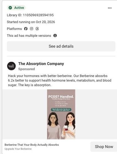
- How a sketched before-and-after pitched berberine for PCOS
- How a creator's lunch bowl set up a berberine routine ad
- How a new mom's kitchen story sells The Absorption Company berberine
- How a creator explained berberine absorption in plain words
- How a new mom's craving story sells The Absorption Company's berberine
- How a creator frames switching berberine brands as not your fault
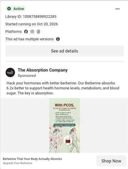
- How The Absorption Company draws a PCOS before and after for berberine
- How a creator teaches the milligrams vs absorption rule for berberine
- How a comment reply turns a berberine testimonial into an answer
- How a creator reframes no results as the wrong berberine
- How a creator uses a doctor's article to introduce berberine for PCOS
- How a new-mom creator video sells The Absorption Company's berberine
- How a comment-reply opener reframes a berberine creator video
- How The Absorption Company speaks to PCOS in an illustrated static
- How a quiet-PCOS illustration pitches The Absorption Company berberine
- How a brand-switcher creator story sells Absorption Company berberine
- How The Absorption Company spoke to women with PCOS in one static ad
- How The Absorption Company made a talking capsule tell a 30-day story
- How The Absorption Company targets PCOS with an illustrated ad
- How The Absorption Company answers berberine's stomach objection
- How The Absorption Company told a berberine story in text bubbles
- How The Absorption Company sold berberine absorption with a pill count
- How The Absorption Company used a lab scene to sell a berberine switch
- How The Absorption Company uses a bold checklist to sell berberine
- How The Absorption Company answers a skeptical comment about berberine
- How The Absorption Company puts a money-back guarantee on a static
- How The Absorption Company sells berberine through a creator explainer
- How The Absorption Company fits berberine into a creator's routine
- How The Absorption Company shows when berberine fits into a day
Captured from absorbmore.com in October 2026 for the Fluid Inspiration Library. Offers and prices change; this is what the page showed when we captured it.