Careclarkbsn with The Absorption CompanySponsored
Esc
How The Absorption Company ties berberine to a busy workday
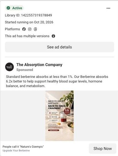
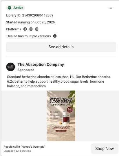
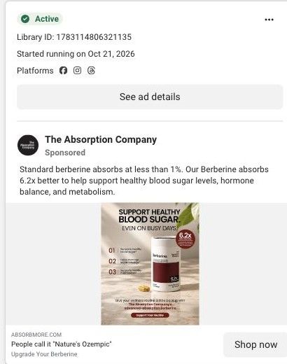
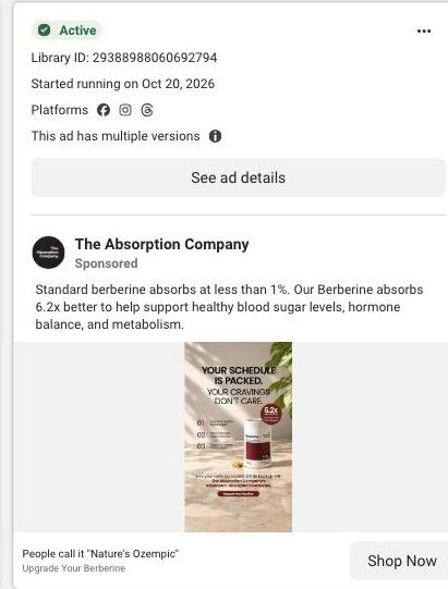
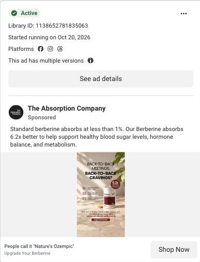
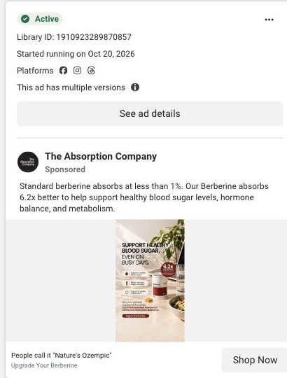
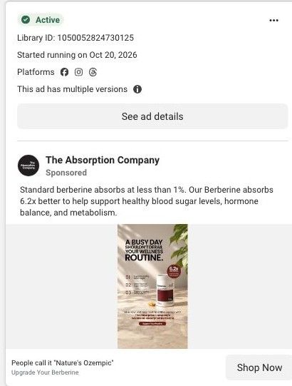
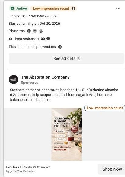
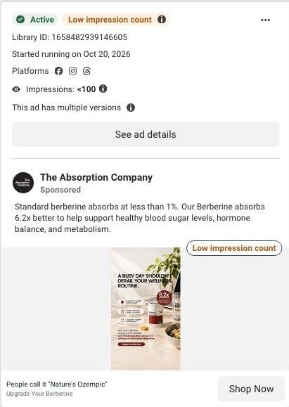
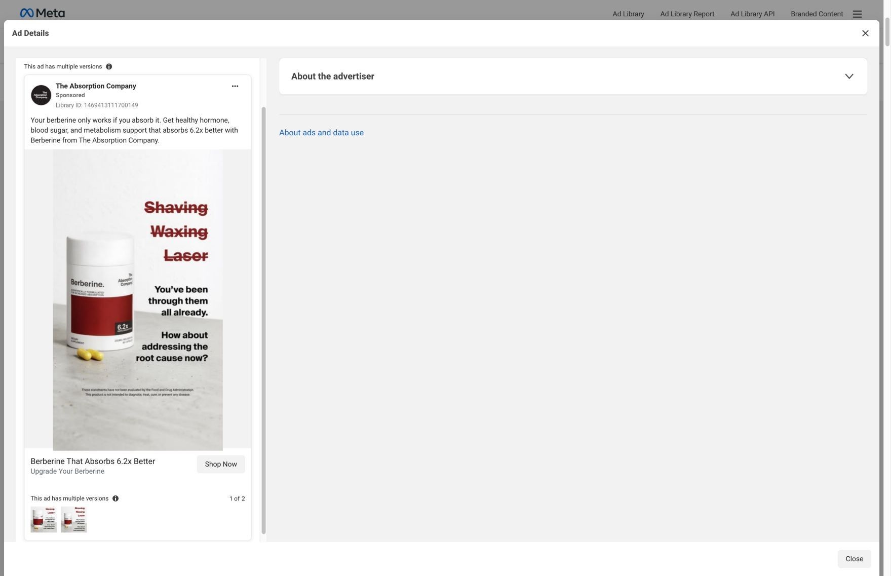
A static Meta image ad for The Absorption Company's berberine. A bottle sits on a kitchen counter next to a salad bowl under a headline about back-to-back meetings and back-to-back cravings, with a 6.2x callout and a short benefit list. The headline says people call it Nature's Ozempic. It sends people to a berberine landing page.
The Absorption Company
30 creatives lead here1 / 30
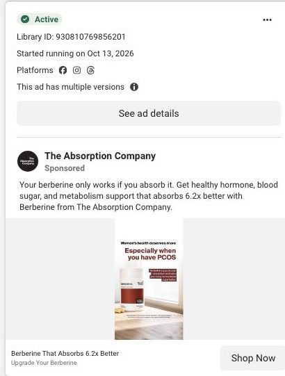
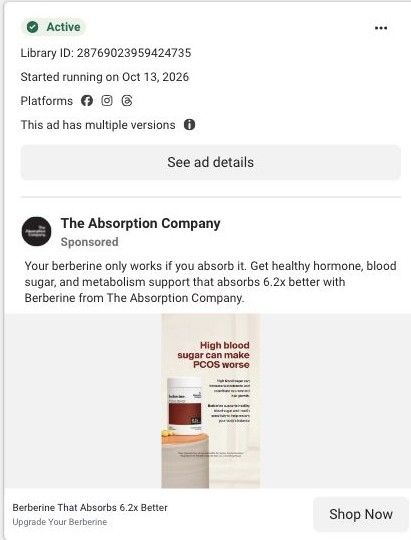
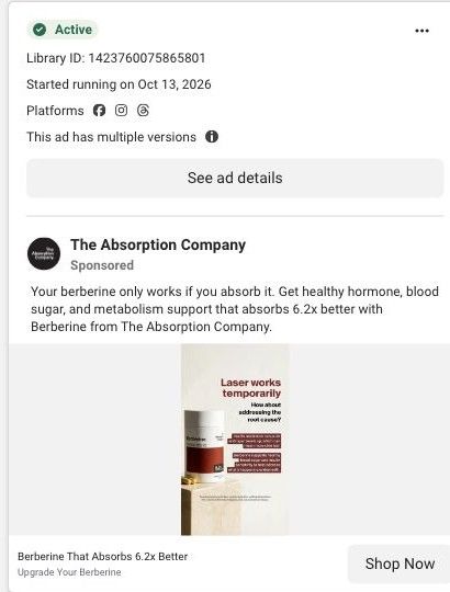
The best berberine · absorption landing page
Active ad and exact outbound link observed in Meta Ad Library on October 22, 2026. The page image and section source are the existing October 20 capture of this destination. Offers and product selections may change. Selection reflects creative and page structure; performance is not available.

People call it "Nature's Ozempic"
Back-to-back meetings · kitchen-counter product layout. A mechanism-led opening continues through benefit cards, creator testimonials, comparisons, and purchase plans. Compare the creative with the destination and explore the other ads sharing this route.
- Brand
- The Absorption Company
- Observed offer
- People call it "Nature's Ozempic"
- Creative angle
- Lifestyle positioning
- Page type
- Product landing
- Ad format
- Image
- Listed start date
- Oct 20, 2026
- Captured
- Oct 22, 2026
- Library ID
- 1422557319378849
- Destination
- absorbmore.com
Selected for its design and offer structure. Ad performance isn’t available in this collection.
What this ad does well
The image headline, "Back-to-back meetings, back-to-back cravings?", names a day the viewer can picture, which is a better opening than a supplement name. The kitchen counter with a salad bowl places the product in a normal routine, so it feels like part of a workday rather than a lab product. The copy then gets specific about the claim (standard berberine under 1%, this one 6.2x better), so the ad moves from a relatable moment to a reason to choose this bottle. The Nature's Ozempic line in the headline is attributed to other people, which is the right way to carry a comparison that strong.
What's missing
The craving moment sets up a problem, but the ad never connects absorption to the meeting-day snacking it opens with, so the viewer has to bridge 'stressful day' and '6.2x' on their own. The benefit list in the image is too small to read in a scroll. If you make one like this, write one line that joins the two ideas (what's different about the 4pm snack when the supplement actually absorbs, attributed to customers), and cut the small benefit text so the headline and the number have room. A customer line from someone with a desk job would add the proof it's missing.
Beat by beat
- ImageThe bottle on a bright kitchen counter beside a salad bowl and a plant, with a 6.2x badge and three small benefit rows.
It places the product inside an ordinary day so the viewer sees where it fits.
- HeadlineA two-line headline pairing back-to-back meetings with back-to-back cravings.
It names a situation the viewer recognizes, which earns the second look the claims need.
- CopyThe copy claims standard berberine absorbs at under 1% and this one 6.2x better for blood sugar, hormone balance and metabolism.
It gives the viewer a reason to pick this bottle over the one they could already buy.
Where it sends people
The ad goes to the brand's focused berberine landing page, which argues absorption from top to bottom: a hero about the berberine that absorbs, a FenuMat section that explains the coating and 12-hour release, a comparison against every other berberine, batch testing, the co-founders, a clinician section and an FAQ. The absorption half of the ad carries straight through. The busy-workday half doesn't appear in the captured section names, so the page never returns to the craving moment that got the click. A short section on how customers use it during a workday would tie the two together. It's one of 30 ads in the library that land here.
The page it sends people to: How The Absorption Company sells berberine with a buyer's guide page
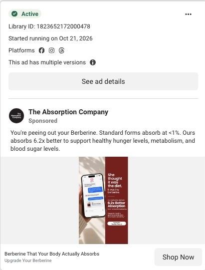
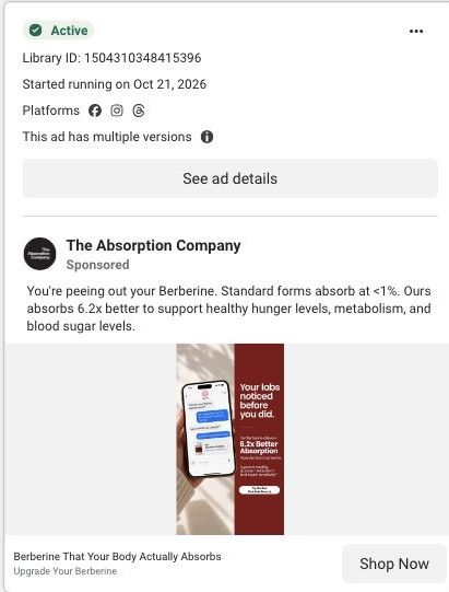
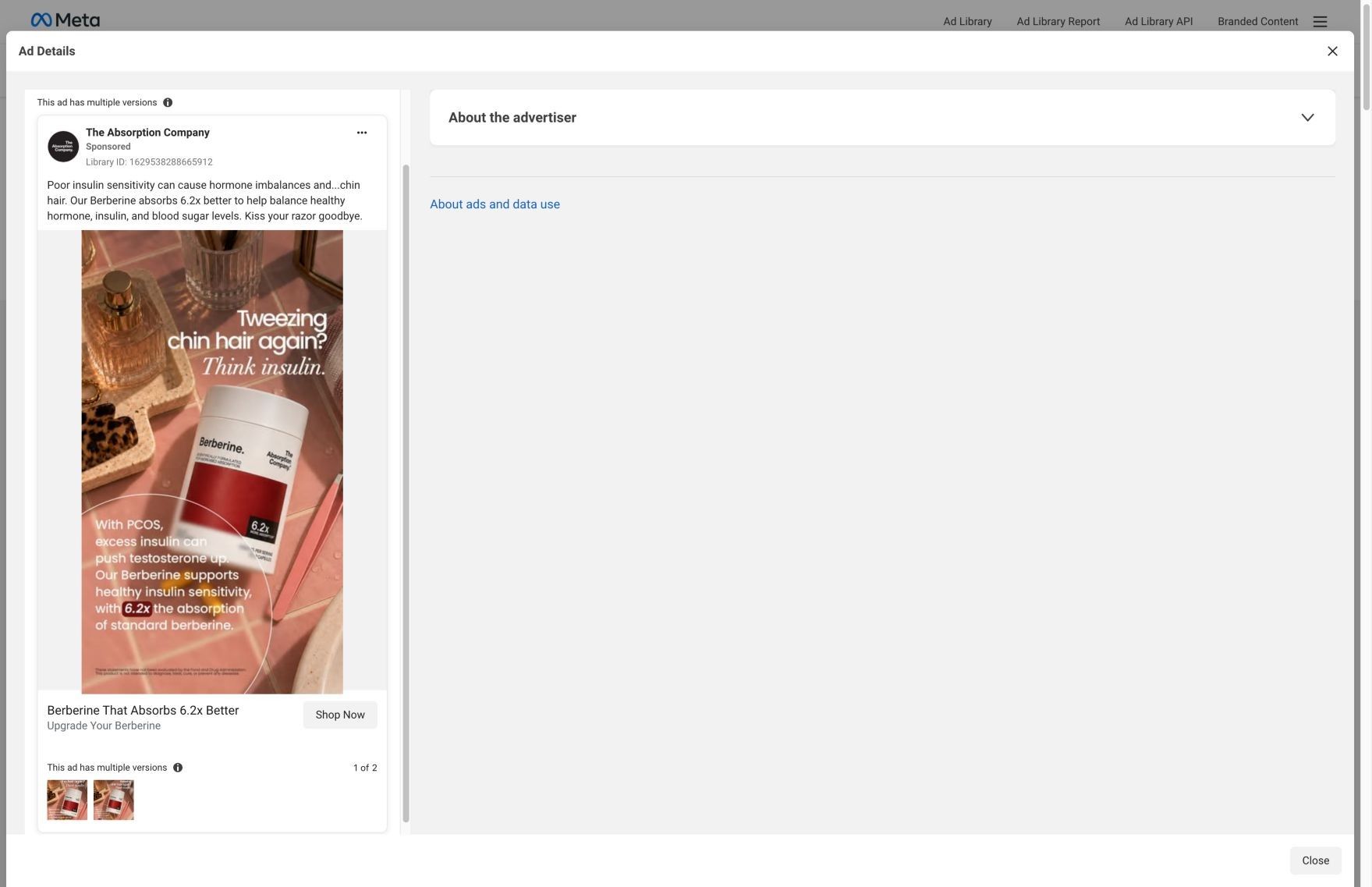
A long berberine landing page styled as a 2026 buyer's guide, built around the brand's claim that its FenuMat coating puts 6.2x more berberine in your blood. 30 Absorption Company ads in the Fluid library link here, mostly 6.2x absorption statics, "Nature's Ozempic" lifestyle statics and creator testimonial videos.
How the page is built
- 01Buyer's guide hero
States the absorption promise, shows the crossed-out price and guarantee, and pictures the claim with a blood-level bar chart, answering what this is and why this berberine.
- 02Benefit cards and stat tiles
Lists the appetite, energy, blood sugar and weight claims with stat tiles and a customer quote, answering what you'd buy berberine for.
- 03Why absorption matters
Argues you can't feel a capsule that never reaches your blood, answering why other berberine may have done nothing for you.
- 04FenuMat explainer
Breaks the delivery system into fenugreek fiber coating, surviving stomach acid and a 12-hour release, answering how the product claims to work.
- 05Comparison table
Puts The Absorption Company against every other berberine in a tinted two-column table, answering why this one over a cheaper bottle.
- 06Batch testing
Claims every batch is tested while most brands don't test, answering whether the product is what the label says.
- 07Co-founder story
Pairs a founder portrait with why they started the company, answering who is behind the brand.
- 08Clinician proof
Says 780 clinicians share the company on FrontrowMD without compensation, answering whether professionals stand behind it.
- 09Switching story
Describes what changes when you switch from standard berberine, answering what you can expect after ordering.
- 10Purchase block
Restates the absorption promise beside the berberine plans, answering how to buy and at what price.
- 11FAQ
An accordion of pre-purchase objections, answering the last questions that stop someone from ordering.
The first fixes we would make
- The "Nature's Ozempic" statics land on a hero about absorption, so those visitors arrive expecting an appetite story and get a bioavailability lesson first. Build a hero variant for that traffic that leads with appetite and cravings (the brand already wrote one on its curb-cravings version of this page) and keep everything below it the same.
- Several ads are tagged audience-specific, but the page speaks to everyone. Add a short line or block near the hero that names who the ad was talking to, so a visitor sees their situation reflected before the mechanism explainer starts.
Read the full breakdown of this page
Three hooks you could test
- Show a specific moment of use. “Third meeting, no lunch, and the vending machine is calling. Here's what's in my bag instead.”
- Lead with the uncomfortable problem. “Your calendar is the reason you're raiding the snack drawer at 4pm.”
- Make the product the whole scene. “Laptop open, salad half-eaten, one bottle on the counter.”
What to borrow for your brand
- Open with the situation the problem happens in (a packed calendar) instead of the product category, so viewers recognize their own day.
- Stage the product in the room where the problem happens, like a kitchen counter for a craving ad, so it reads as part of the routine.
- When you use a strong comparison, attribute it to what people call the product so it reads as reputation instead of a direct claim.
One of 188 The Absorption Company ads in the Fluid Inspiration Library, captured from the Meta Ad Library on Oct 22, 2026. We record that an ad ran publicly, not how it performed.